Top Living Room Color Schemes: Expert-Approved Stylish Pairings for Your Space
Transforming your living room’s ambiance hinges greatly on selecting the ideal paint color combination. The colors you pick for your walls set the tone and style, shaping the entire room’s atmosphere. Top interior designers highlight specific color pairings that harmonize to craft environments that are both inviting and stylistically unified. Whether you’re leaning toward gentle neutrals or vivid accent hues, these expertly curated palettes take the uncertainty out of color selection, guiding you to the perfect choice that matches your vision.
Top 20 Living Room Paint Pairings Recommended by Professionals
Picking the perfect hue for your living room involves more than just taste—it’s about setting an inviting mood.
The Best Living Room Paint selections span from serene neutrals like White Dove OC-17 and Cotton Balls OC-122 to dramatic choices such as Black Raspberry 2072-20.
For a refined ambiance, explore deep teals like Gentlemans Gray. Meanwhile, adaptable grays such as Dolphin AF-715 complement an array of styles and color schemes.
Serene Sage Green Paired with Cozy Ivory: Inspired by Nature’s Calm
In a world bustling with activity, many homeowners seek solace in tranquil hues. The blend of sage green with a warm ivory tone fosters a naturally peaceful environment.
This palette is perfect for amplifying daylight, bringing a balanced, earthy vibe that gracefully suits an array of interior décors.
Whether hosting friends or enjoying quiet moments, this color duo creates an inviting retreat that exudes comfort and calm.
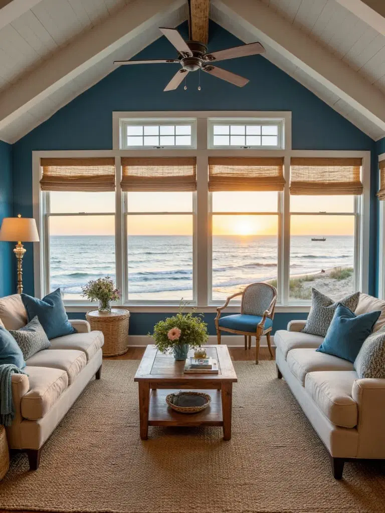
Classic Navy and Bright White: A Refined Coastal Look
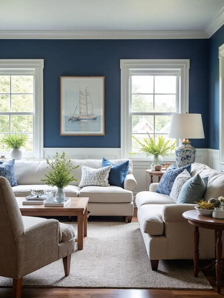
Bold navy blue teamed with brilliant white crafts a timeless yet striking palette, ideal for a sophisticated coastal-style living room.
Evoking imagery of ocean waves and clear skies, this combination brings a dynamic yet elegant flair.
Integrate natural elements like distressed wood or woven textures to soften the look and produce a cozy yet polished space.
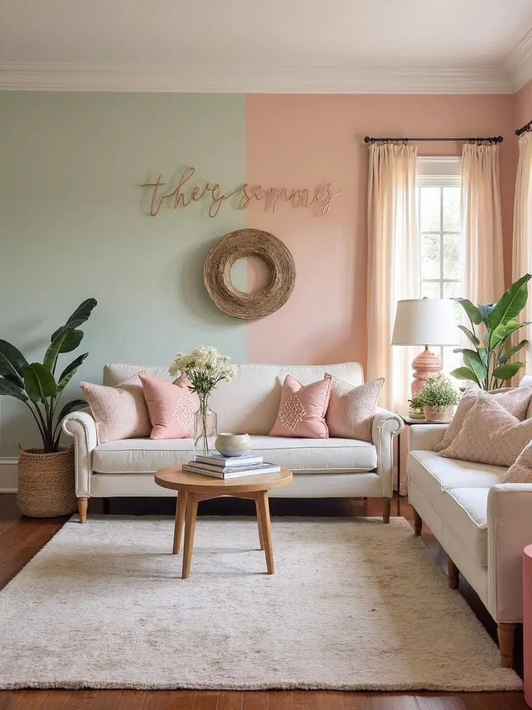
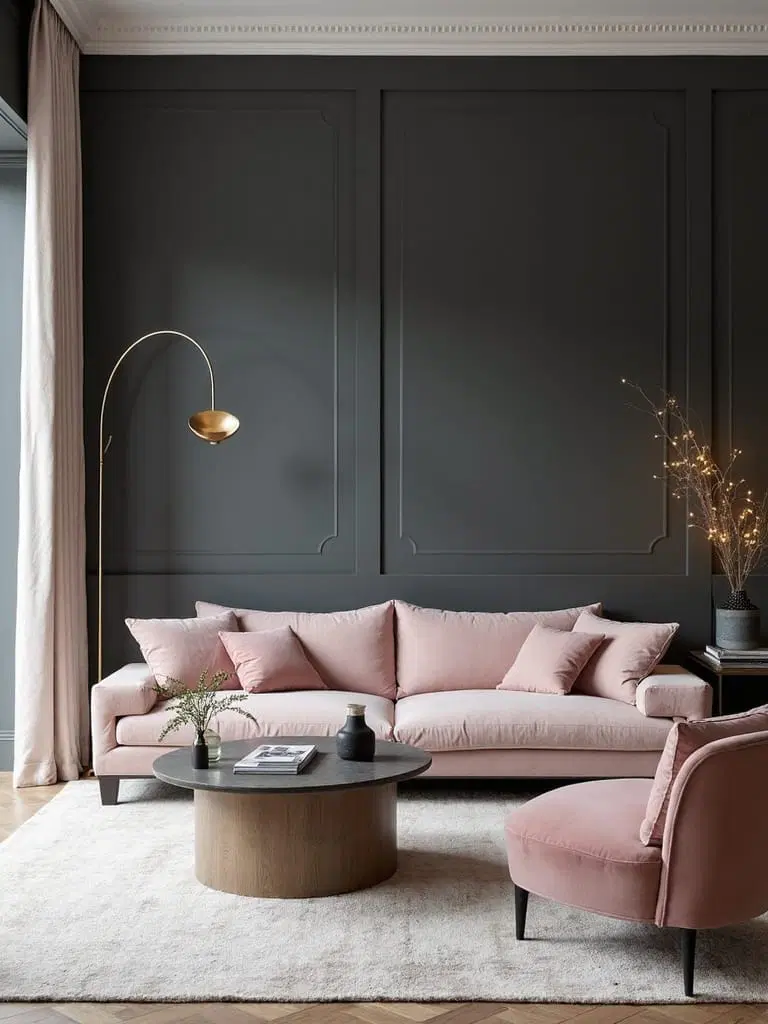
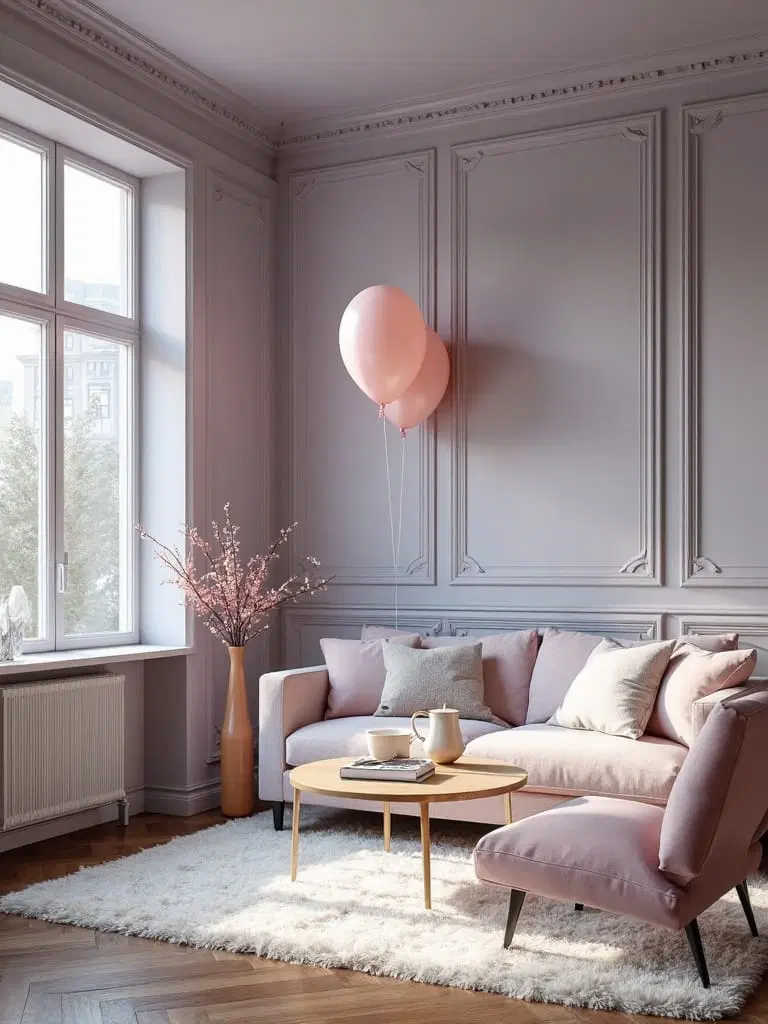
Delicate Blush and Deep Charcoal: Chic Contemporary Blend
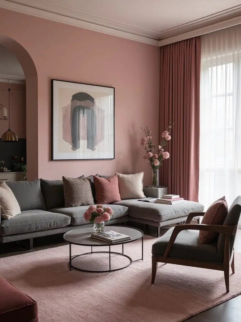
The soft warmth of blush pink paired with the strong drama of charcoal gray is becoming a popular contemporary choice, blending warmth with modern sleekness.
This pairing enriches the room by balancing soothing tones with a grounding presence, enhanced further by gold or natural wood accents for added richness.
Opulent Burgundy and Cream: Revisiting Classic Luxury
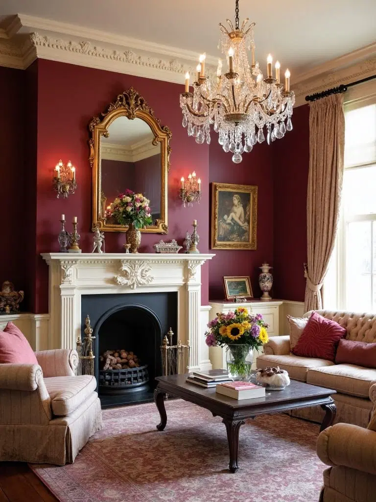
For a space that honors tradition with a touch of grandeur, pairing rich burgundy with soft cream tones creates a lavish, welcoming environment.
Introduce cream on expansive surfaces like walls or upholstery to keep the space feeling open, while burgundy shines through accent décor, imbuing warmth and elegance.
Warm Terracotta with Soft Desert Beige: Southwest Style Comfort
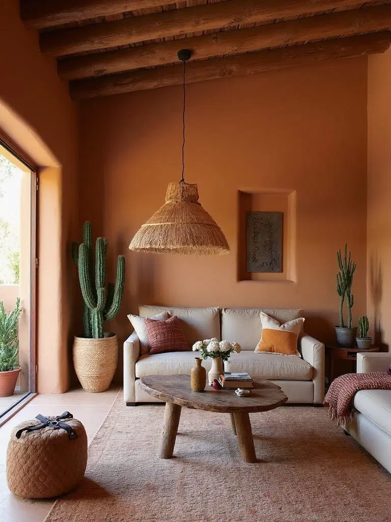
Incorporate the sun-soaked essence of the Southwest with earthy terracotta paired with complimentary desert beige hues.
Feature terracotta on an accent wall for vibrancy, balanced by beige walls to maintain serenity. The pairing is completed beautifully with wooden furnishings and woven materials that emphasize natural textures.
Teal with Gold: The Charm of Jewel-Toned Elegance
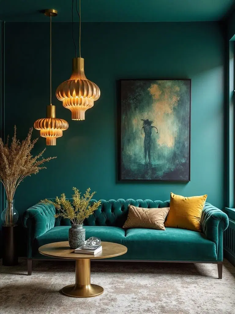
For those drawn to sumptuous, regal-inspired palettes, deep teal walls paired with delicate brushed gold accents infuse the living room with quiet luxury.
Rich colors like Tucson Teal or Gentlemans Gray create warmth, while gold fixtures and velvet furnishings add depth and texture to this jewel-tone design.
Bright Yellow and Soft White: Energize Your Morning Routine
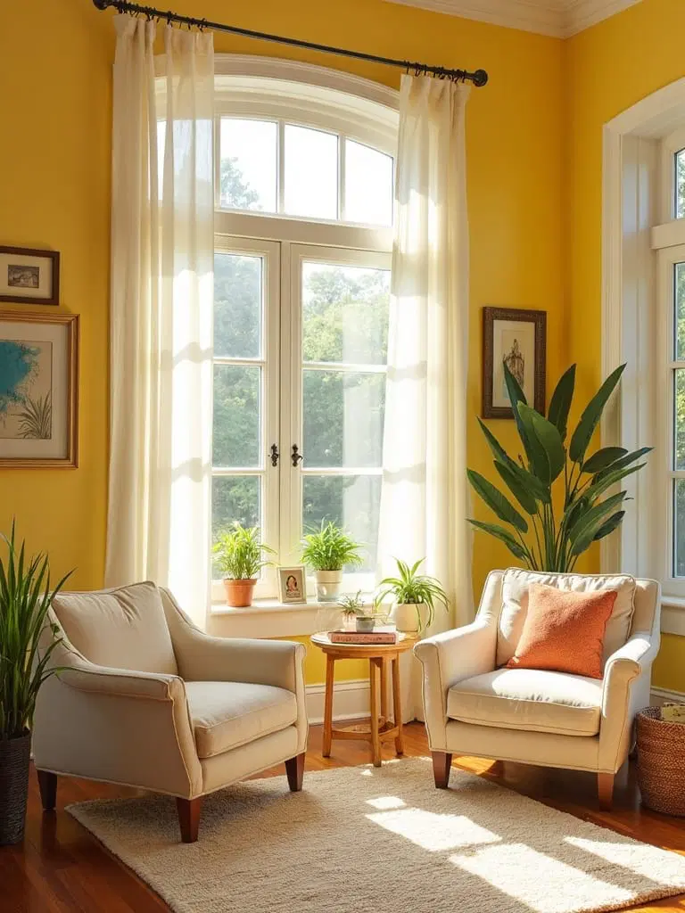
To infuse your living room with optimism and vitality, the combination of a sunny yellow with a pristine white establishes a cheerful atmosphere that invigorates each morning.
This color duo reflects and amplifies natural light, creating an energizing, balanced backdrop perfect for bright, lively spaces.
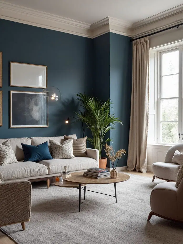
Smoky Blue-Gray Matched with Warm Wood Accents: Harmonious Serenity
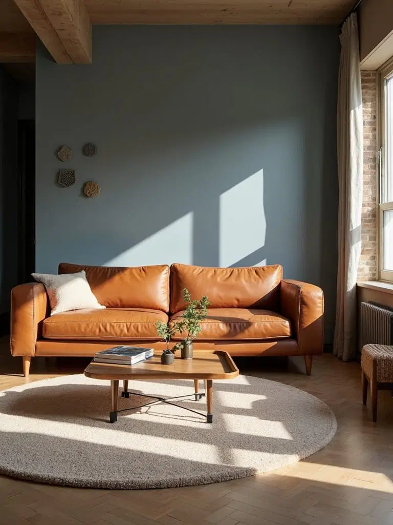
Transitioning to refined tranquility, smoky blue-gray creates a peaceful and balanced vibe that perfectly pairs with lush wood furniture and flooring.
This combination soothes while enhancing ambient light, making the room feel simultaneously expansive and intimate—the perfect sanctuary to unwind.
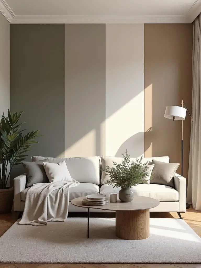
Earthy Olive and Gentle Taupe: A Time-Honored Natural Base
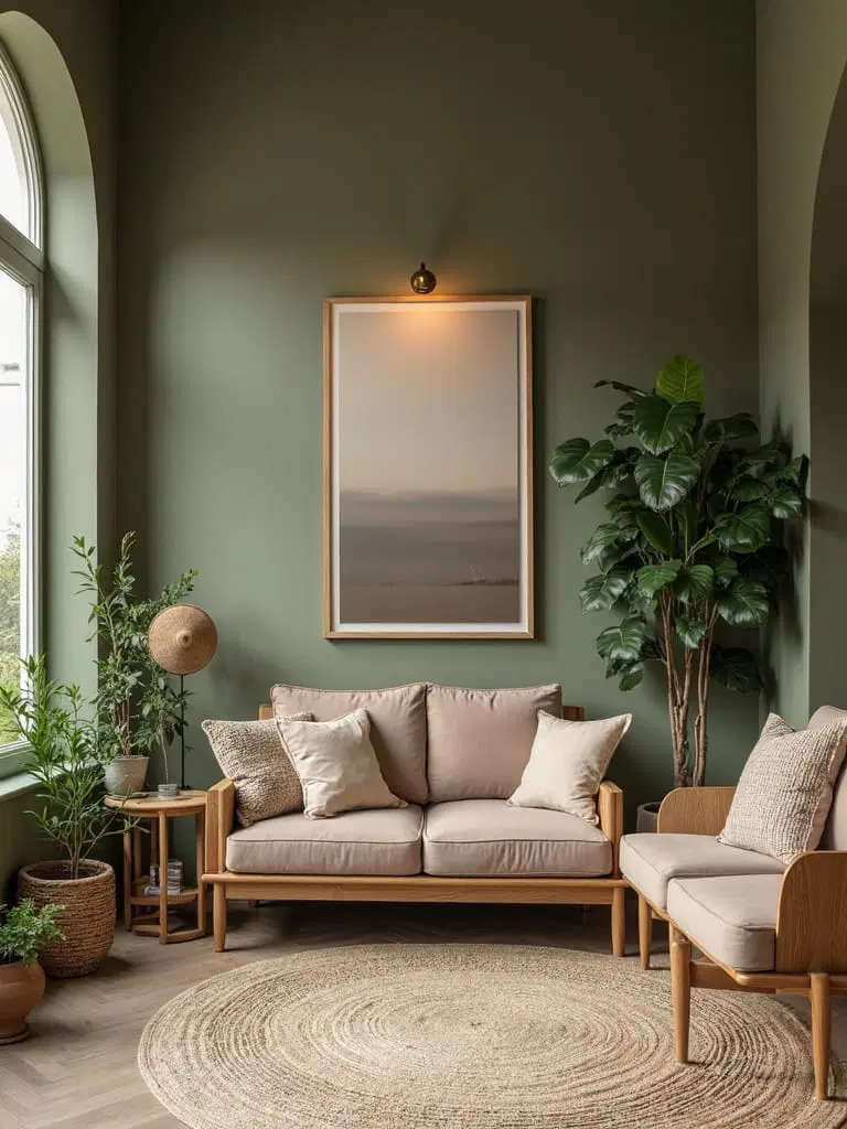
For a grounded and timeless appeal, pairing olive green with soft taupe creates an organic canvas that invites natural elements indoors.
This duo fosters relaxation and subtle sophistication, working seamlessly with varied décor styles, enriched by natural fibers and warm accent pieces.
Striking Charcoal and Soft Blush: A Bold Contrast That Charms
Make a stunning impact with the energetic pairing of bold charcoal and delicate blush pink, a contrast that is both eye-catching and balanced.
Use charcoal on an accent wall to anchor the space, complemented by blush furnishings and shimmering metallic accents for a luxurious yet approachable aesthetic.
Light Powder Blue Coupled with Crisp Linen: Scandinavian Serenity
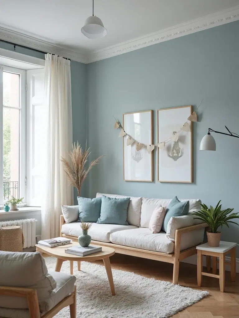
A harmonious duet of powder blue and crisp linen effortlessly creates an airy, Scandinavian-inspired sanctuary.
This color scheme vividly enhances natural light, opening up compact spaces while radiating tranquil calmness. Incorporate wooden accents and tactile fabrics to complete this inviting minimalist look.
Lush Emerald Green Blended with Vintage White: Victorian Grandeur
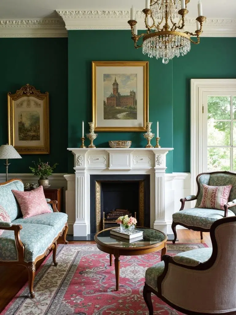
Deep emerald green evokes a regal Victorian atmosphere when paired with antique white trim, which emphasizes architectural flourishes while maintaining brightness.
This dynamic combination balances rich historical flair with a fresh update, pairing exceptionally well with vintage accessories and brass or gold embellishments.
Cozy Caramel with Soft Mushroom: Layered Neutral Warmth
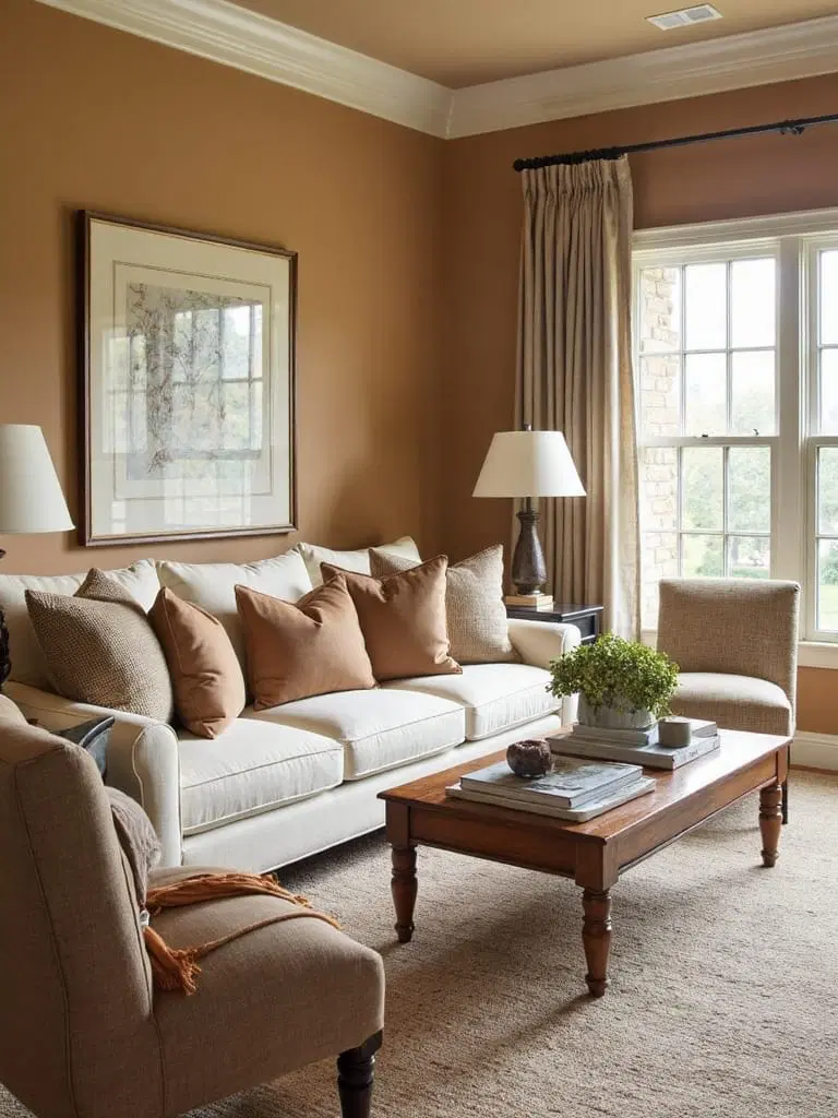
Favoring comfort and subtlety, blending warm caramel and creamy mushroom shades creates a layered neutral foundation that feels both soothing and rich.
These shades are ideal for cozy living areas, playing well with textured wood and plush fabrics that invite relaxation.
Soft Lavender with Silvery Gray: Elegant Solution for Compact Rooms
When space is tight, the fusion of muted lavender and cool silvery gray visually expands your living room while maintaining softness and sophistication.
This refined palette brightens dim areas and complements both modern and classic furniture with an understated charm.
Rustic Red and Weathered Gray: Timeless Farmhouse Appeal
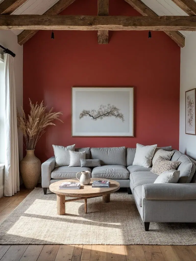
Set the scene for rustic warmth and nostalgia with this pairing of weathered gray walls and lively rustic red accents reminiscent of cozy farmhouse interiors.
Gray acts as the neutral backdrop, allowing red pillows, artwork, or décor to shine, achieving a harmonious blend of traditional charm and contemporary comfort.
Intense Indigo with Soft Alabaster: Play of Light and Shadow
Balance boldness and brightness with deep indigo walls contrasted by soft alabaster trims and furnishings.
This mix suits rooms that face west, as indigo creates intimate warmth by absorbing light, while alabaster walls and accents keep spaces feeling open and fresh.
Accent walls in indigo can also help define open-plan living without closing in the area.
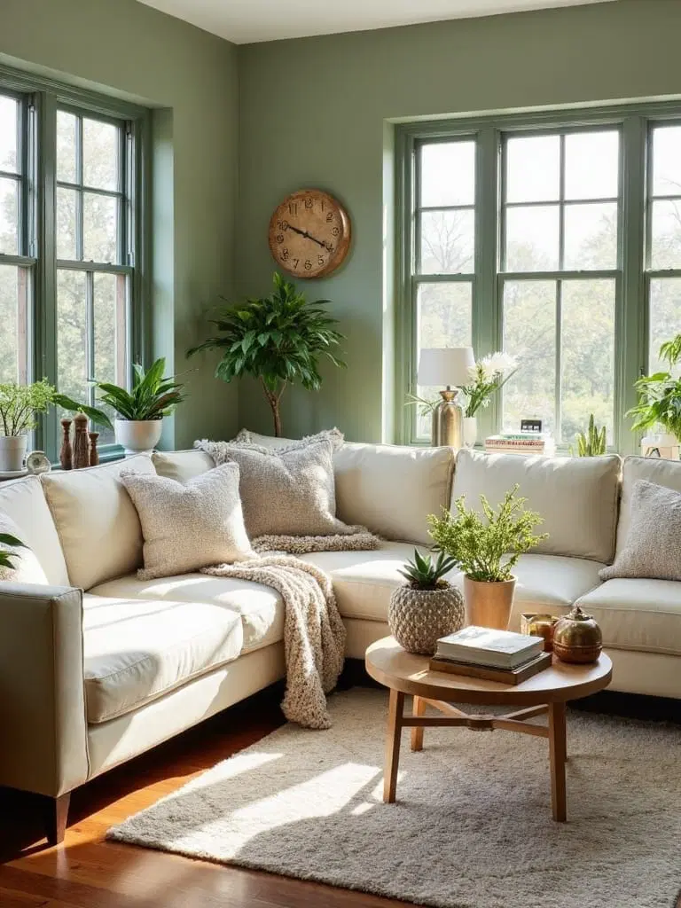
Forest Green and Honey Tones: A Rustic Haven
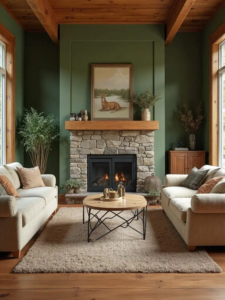
Draw inspiration from woodland retreats by pairing soft mossy green shades with warm honey-colored wood finishes.
This combo creates a tranquil, nature-influenced living space. Rich textures like leather and stone tie the look together, inviting relaxation and sociability.
Neutral Dove Gray with Crisp White: The Ultimate Minimalist Backdrop
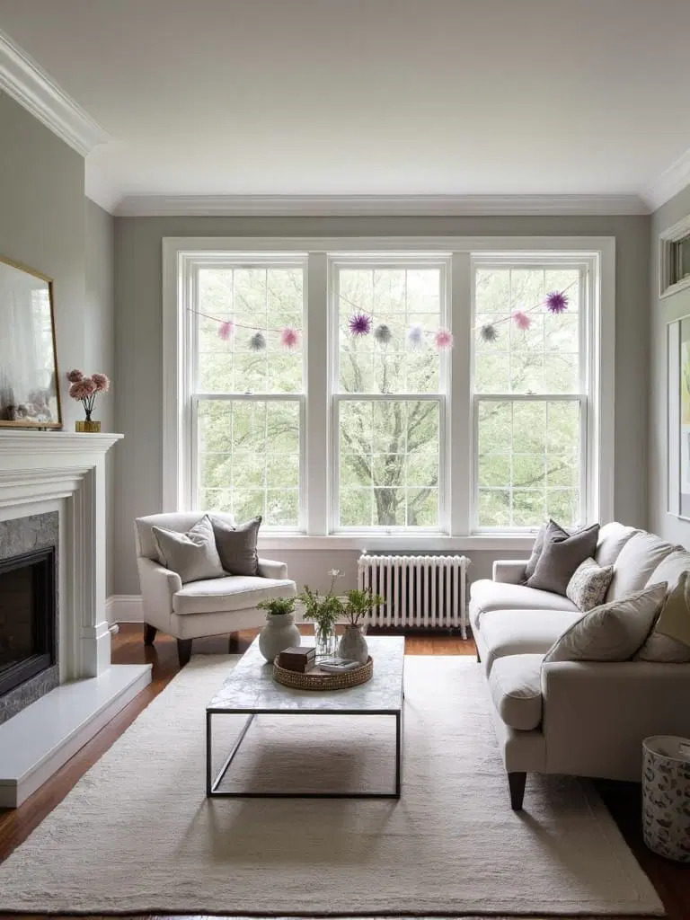
Solidify a space of simple elegance by using nuanced dove gray alongside bright white. This trusted color pairing functions as a streamlined backdrop perfect for showcasing furnishings of diverse styles.
The colors especially shine in naturally lit rooms, promoting an airy, soothing environment ideal for social settings.
Stormy Blue Combined with Warm Beige: Coastal Charm Redefined
This pairing takes you beyond plain neutrals to a sophisticated coastal vibe. The cool depth of stormy blue balances perfectly with the warmth of beige tones, creating a serene yet inviting atmosphere.
Especially striking in spaces with plenty of sunlight, this palette complements natural wooden furniture and textured fabrics beautifully.
Final Thoughts
Explore these twenty expert-endorsed paint color combinations to elevate the mood and style of your living space. Whether you resonate with the calming effect of sage and ivory or the classic boldness of navy and white, don’t hesitate to test different shades and finishes. Keep in mind how varying light conditions impact color perception throughout the day, and always rely on sample swatches to guide your final decision-making. Your ideal living room color story awaits—embrace the process, and craft a home that truly reflects your unique aesthetic.