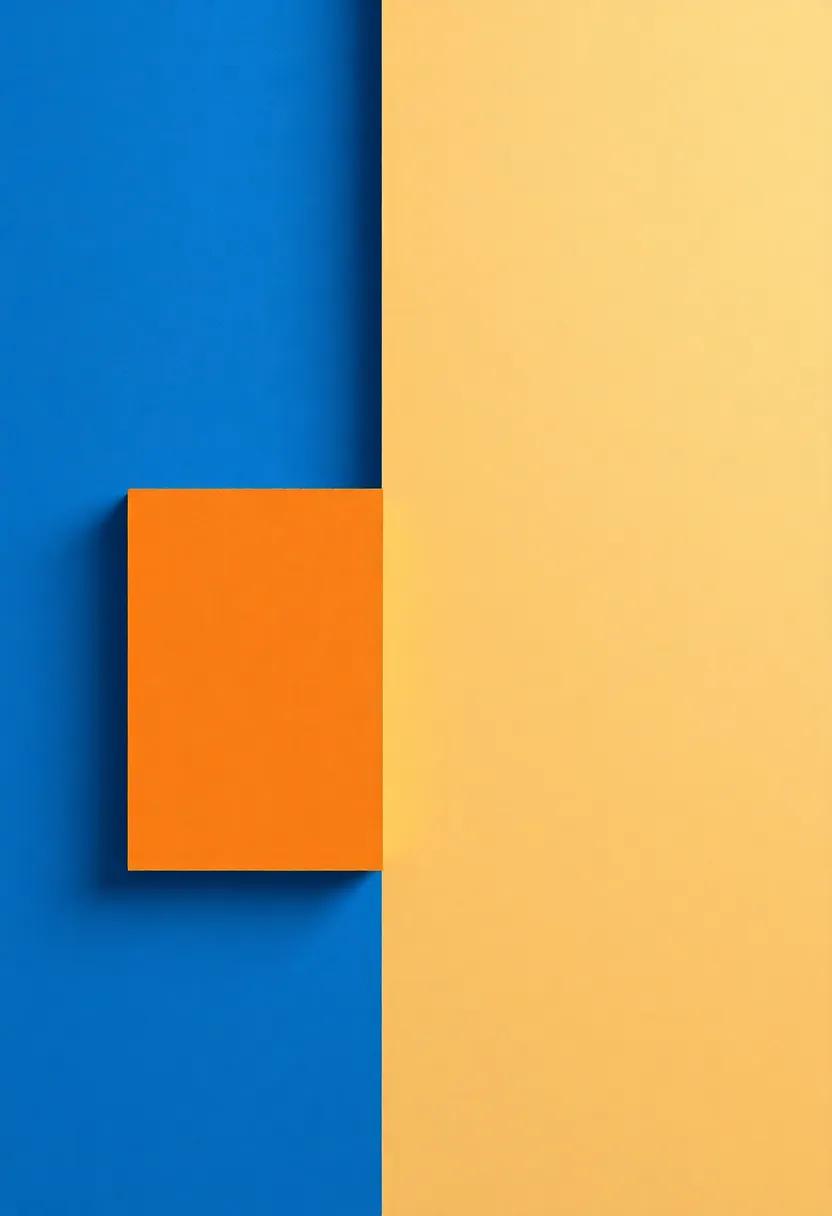
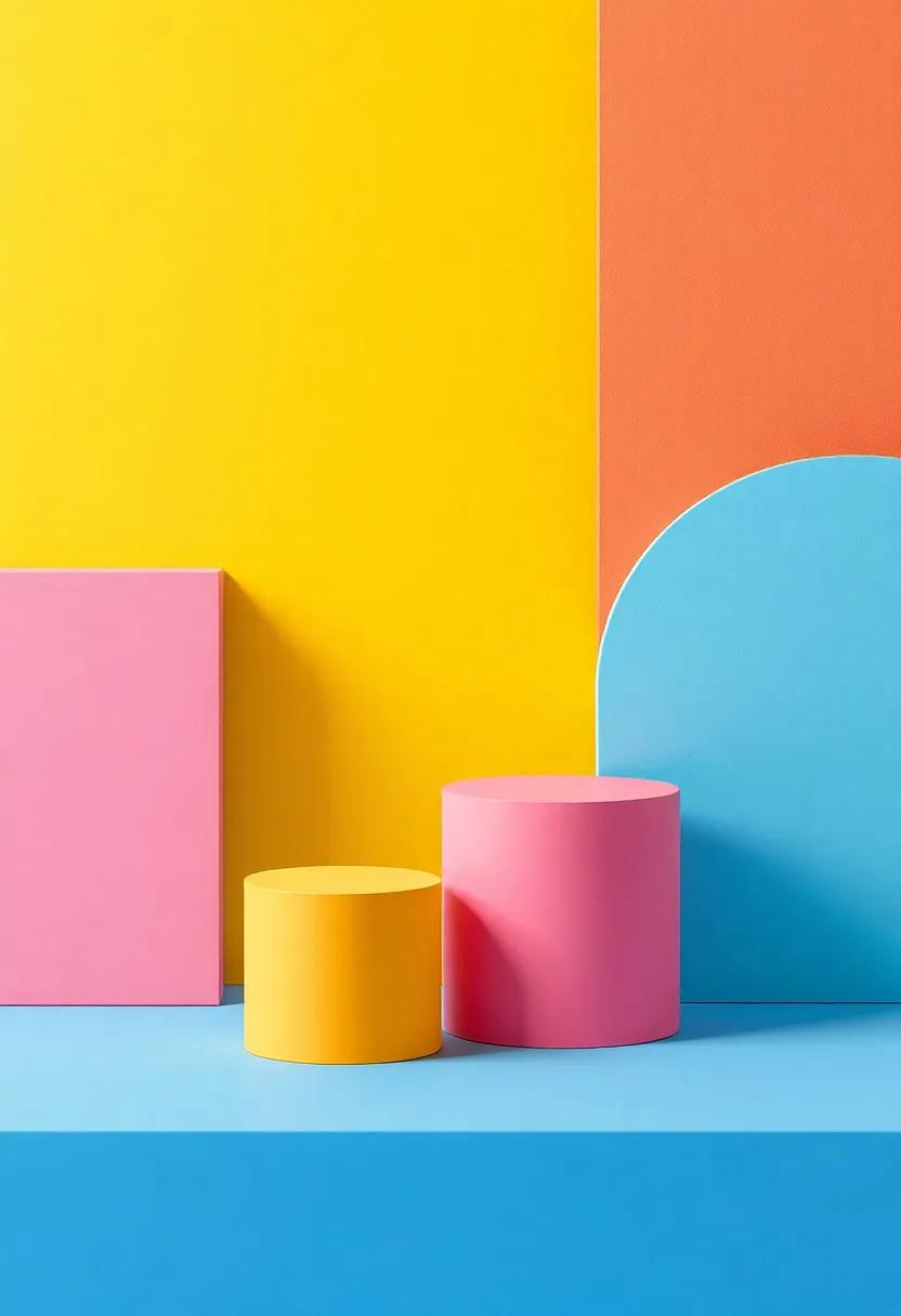
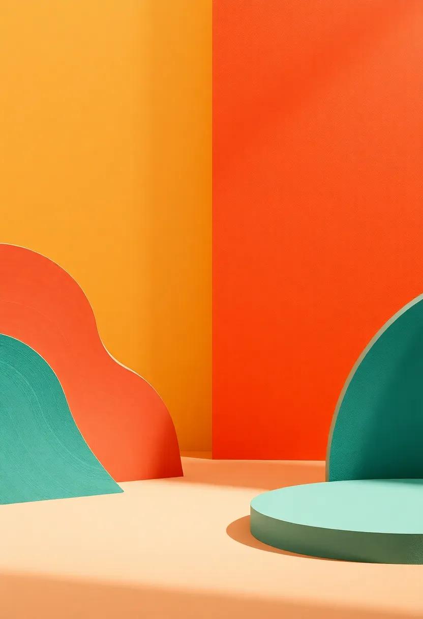
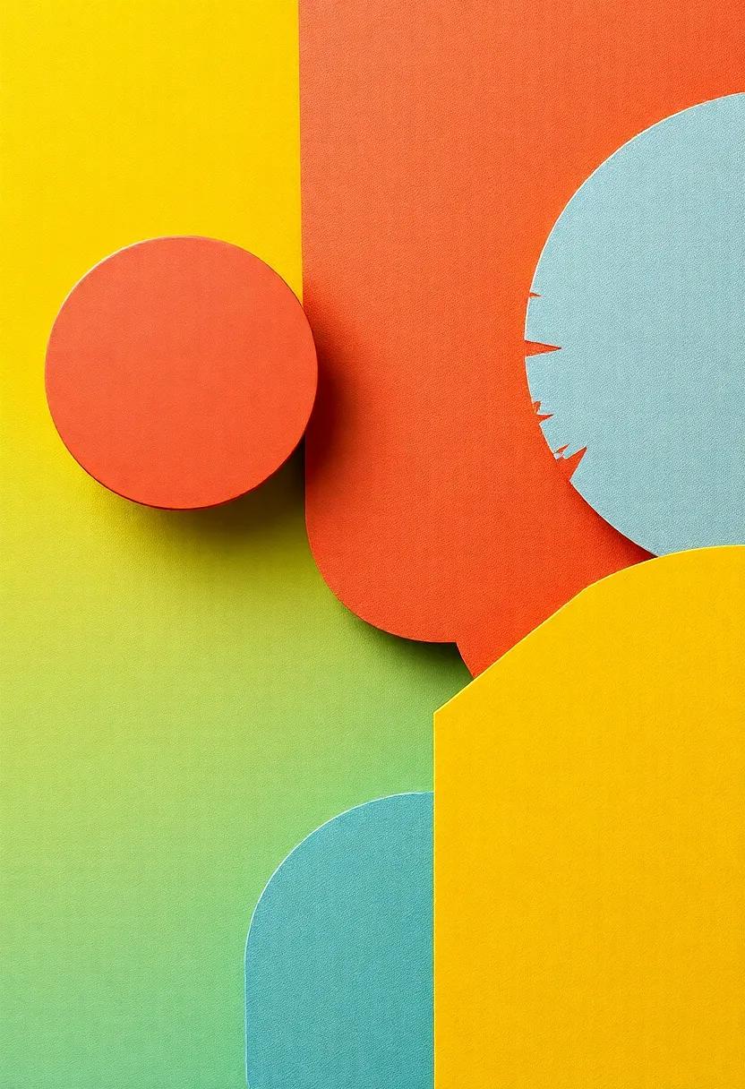
Harmony of Hues and Textures: Exploring the Relationship Between Colors and Materials
In the realm of design, where inventiveness intertwines with vision, the interplay of colors and materials forms a silent yet powerful dialog. Every hue carries a multitude of emotions, while each texture tells its own story, together creating a symphony that captivates the senses and influences our environment. From the warm embrace of sunlit yellows too the cool serenity of oceanic blues,colors transform spaces,setting moods and inspiring feelings. Together, the tactile qualities of materials—be it the soft elegance of silk or the rough authenticity of reclaimed wood—add another dimension to this dynamic interaction. This article delves into the harmonious relationship between colors and textures, exploring how their synergy enhances aesthetic appeal, influences design choices, and ultimately shapes our experiences. Join us on a journey through the world of hues and textures, where creativity knows no bounds and the art of combination ignites inspiration.
harmony Between Color and Material in Interior Design Aesthetic
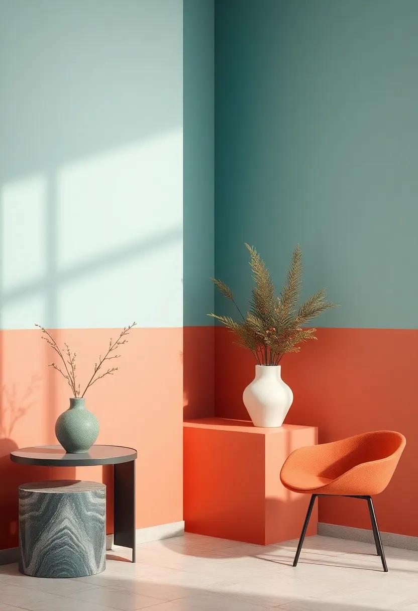
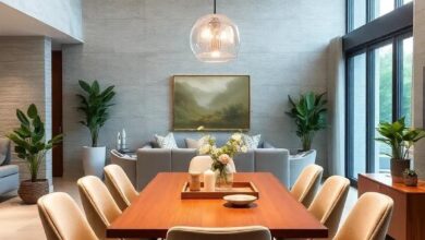
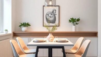
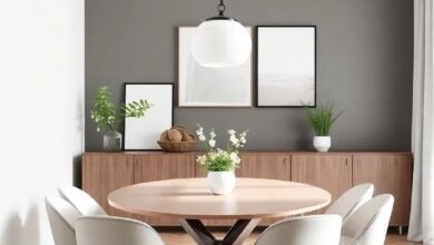
Creating a cohesive interior space involves a thoughtful interplay between colors and materials,where each element enhances the other. The selection of hues can dramatically change the perception of textures, making it essential to consider how colors interact with various materials. For example, natural wood finishes paired with earthy greens evoke a sense of tranquility, while vibrant reds can bring warmth and depth to metallic surfaces. When designing interiors, it’s crucial to assess not just individual colors, but how they resonate with the materials employed, whether they are soft fabrics, robust stone, or sleek glass.
To achieve a harmonious aesthetic, consider embracing a palette that complements the inherent qualities of the materials.Here are a few simple tips to guide your selection process:
- Contrast and Complement: pair soft colors with textured surfaces for depth.
- Monochromatic Layering: Use varying shades of a single color to create unity across materials.
- natural Elements: Incorporate colors inspired by nature to bring balance and authenticity.
The following table illustrates a few ideal pairings of colors and materials to enhance your interior design projects:
| Color | Material | Effect |
|---|---|---|
| Soft Blue | Whitewash Wood | Calm and Serene |
| Mustard Yellow | brushed Brass | Warmth and Opulence |
| Charcoal Gray | Rough Concrete | Modern and Edgy |
Textures That Speak: The Emotional language of Color Pairings
Colors have an innate ability to resonate with our emotions, and when layered with textures, this connection deepens. The softness of pastel hues paired with delicate fabrics like chiffon or silk can evoke feelings of serenity, crafting spaces that promote relaxation and tranquility. In contrast, rich, jewel tones like emerald or sapphire, when combined with rustic materials such as aged wood or stone, can instill a sense of warmth and grounding, transforming the ambiance into something both intimate and inviting.
To illustrate the emotional impact of color-texture combinations, consider the following examples:
| Color | Texture | Emotional Response |
|---|---|---|
| Soft Blue | Cozy Knit | Calmness |
| Sunshine Yellow | Rough Wood | Joy |
| Deep Red | Smooth Leather | Passion |
| earthy Green | Natural Stone | Stability |
Each combination acts like a dialogue, where texture adds depth and dimension to the narrative told by color. The interplay creates an emotional landscape that can inspire creativity,invite conversation,or foster solitude,proving that the art of pairing colors and materials is not merely aesthetic but a profound expression of human experiences and emotions.
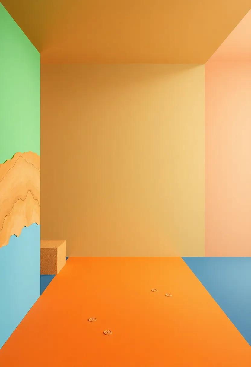
The Dance of Light: How Color and Material Interact in Natural Settings
The interplay of light and texture creates an enchanting symphony in the natural world, where colors dance and materials respond in mesmerizing ways. Sunlight filtering through leaves paints the ground with dappled shadows, crafting a mosaic of vibrant greens and warm browns. Each hue interacts uniquely with its surroundings, producing captivating visual experiences that evoke emotion and inspiration. Elements like stone and water not only reflect these colors but also influence them; as a notable example, a glimmering pool may intensify the azure of the sky, while moss-covered rocks take on emerald tones when kissed by dew. This continuous interaction between color and material emphasizes the richness of our environment and invites deeper contemplation of nature’s artistry.
In exploring this relationship further, we recognize how different surfaces alter our perception of color. Smooth glass surfaces reflect and refract light, resulting in vivid splashes of color that seem to pulse with energy, whereas rough, textured surfaces absorb light, muting colors and fostering a sense of calm. Notably, the use of natural materials in art and design showcases this principle beautifully. Consider the following elements that illustrate how various materials interact with color:
| Material | color Interaction | Effect on Perception |
|---|---|---|
| Wood | Warm Earth Tones | Inviting and Cozy |
| Metal | Cool Reflective Shades | Sleek and Modern |
| Textiles | Vibrant Patterns | Dynamic and Lively |
This nuanced dialogue between light, color, and material enriches our experience, reminding us of the beauty inherent in the world around us. As we stroll through forests, wander along beaches, or immerse ourselves in urban landscapes, we are continually surrounded by this intimate dance—one that speaks to the very essence of nature’s design.
Creating Depth: Layering Textures with Complementary Colors
To truly embody the art of layering,it’s essential to explore textures alongside complementary color palettes. When these elements converge,they create an illusion of depth and rich visual intrigue. For instance, imagine a deep navy fabric paired with a soft peach accent. This combination not only highlights the richness of the navy but also allows the peach to pop, inviting the eye to dance between the contrasting textures. Incorporating a variety of materials, such as satin, linen, and wool, further enhances this dynamic; each texture reacts differently to light, enriching the overall aesthetic without overwhelming the senses.Emphasizing both texture and hue can result in an unexpected yet harmonious design that captivates the viewer.
Consider experimenting with the following combinations to achieve a captivating depth:
- Rustic wood and creamy beige: The rawness of the wood brings warmth that complements the softness of beige.
- Glossy ceramics and muted greens: Shiny surfaces reflect light,while matte finishes create a balanced calm,offering depth.
- sheer fabrics and bold colors: Layers of transparency can soften otherwise stark hues, adding complexity.
By observing the relationships between colors and materials, designers can curate spaces that tell a story and evoke emotions. The right blend can create a seamless flow, guiding the viewer through a thoughtfully crafted environment.To illustrate these relationships, refer to the table below outlining popular complementary color-tensor pairings that enhance depth and character in your designs.
| Color Pairing | texture Combination |
|---|---|
| Turquoise and Coral | Glass and Cotton |
| Mustard Yellow and Teal | Velvet and Metal |
| Plum and Chartreuse | Leather and Canvas |
The Influence of Cultural Context on Color and Material selection
Colors and materials carry different meanings and evoke various emotions depending on the cultural backdrop in which they are perceived.For instance, in some cultures, vibrant hues like red signify luck and celebration, while in others, they may represent danger or aggression. The emotional resonance of color can deeply influence decision-making when selecting interior decor, fashion, or branding. This means that designers must bridge their creativity with an understanding of the cultural meaning behind each color choice. Furthermore, the textures of materials also play a crucial role; a smooth, glossy finish may be associated with luxury in one culture while being perceived as cold in another. Thus, blending color and texture thoughtfully allows creators to connect on a deeper level with their audience.
- Western Cultures: Favor bright primary colors and smooth materials for modern aesthetics.
- Eastern Cultures: Frequently enough gravitate towards earthy tones and natural textures, reflecting a harmony with nature.
- African Cultures: Utilize bold patterns and rich colors, often for storytelling and cultural heritage representation.
Moreover, when designing with color and material, context is key. Regional preferences can dictate the success of a particular palette, with certain colors and materials being more prevalent in specific locales. For example, coastal regions frequently enough embrace lighter, airy colors and more fluid materials to emulate the serenity of the sea, while urban environments tend to favor darker, richer tones that echo a more industrial aesthetic. Understanding these subtleties helps brands create more relevant and relatable products. A table below illustrates how different regions may favor various material and color combinations:
| Region | Preferred Colors | Common Materials |
|---|---|---|
| Scandinavia | Soft Pastels | Wood, Linen |
| Japan | Subtle Naturals | Bamboo, Rice Paper |
| Middle East | Rich Jewel Tones | silk, Ceramics |
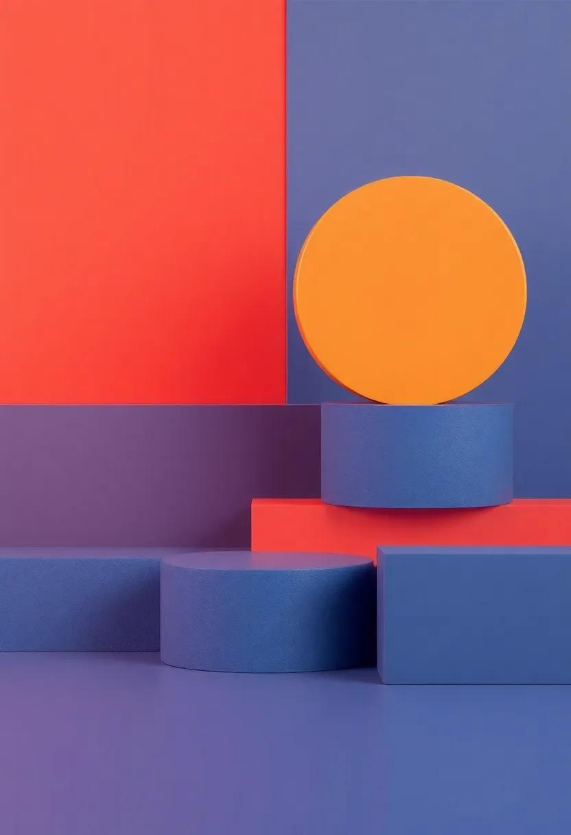
Visual Symmetry: Balancing Colors and Textures in Artful Spaces
In the pursuit of balance within an artistic environment, color and texture serve as the essential elements that elevate a space. When thoughtfully paired, they create a visual symphony that resonates with the viewer, inviting an emotional response. This dynamic interplay can be explored through various strategies, including:
- Contrasting Textures: Combining smooth surfaces with rough textures can create an intriguing juxtaposition that draws the eye.
- Palette Cohesion: Using a unified color scheme helps to ground the space, allowing textures to shine without overwhelming the senses.
- Layering Techniques: Incorporating multiple dimensions through layered materials fosters depth and complexity, enhancing the overall experience.
Color not only dictates the mood but also influences the perception of materials within a space. A harmonious relationship can be effectively achieved by adhering to the following principles:
| Color | Ideal Textures |
|---|---|
| cool blues | Silks,Glass,Smooth Stone |
| Warm Reds | Wood,Textured Fabrics,Leather |
| Earthy Greens | Clay,Natural Fibers,Matte Finishes |
By thoughtfully integrating these hues and textures,spaces transform into artful experiences that resonate with balance and beauty,encouraging not just aesthetic pleasure but also a sense of connection within the environment.
Nature’s Palette: Inspirations from the Outdoors for Home Design
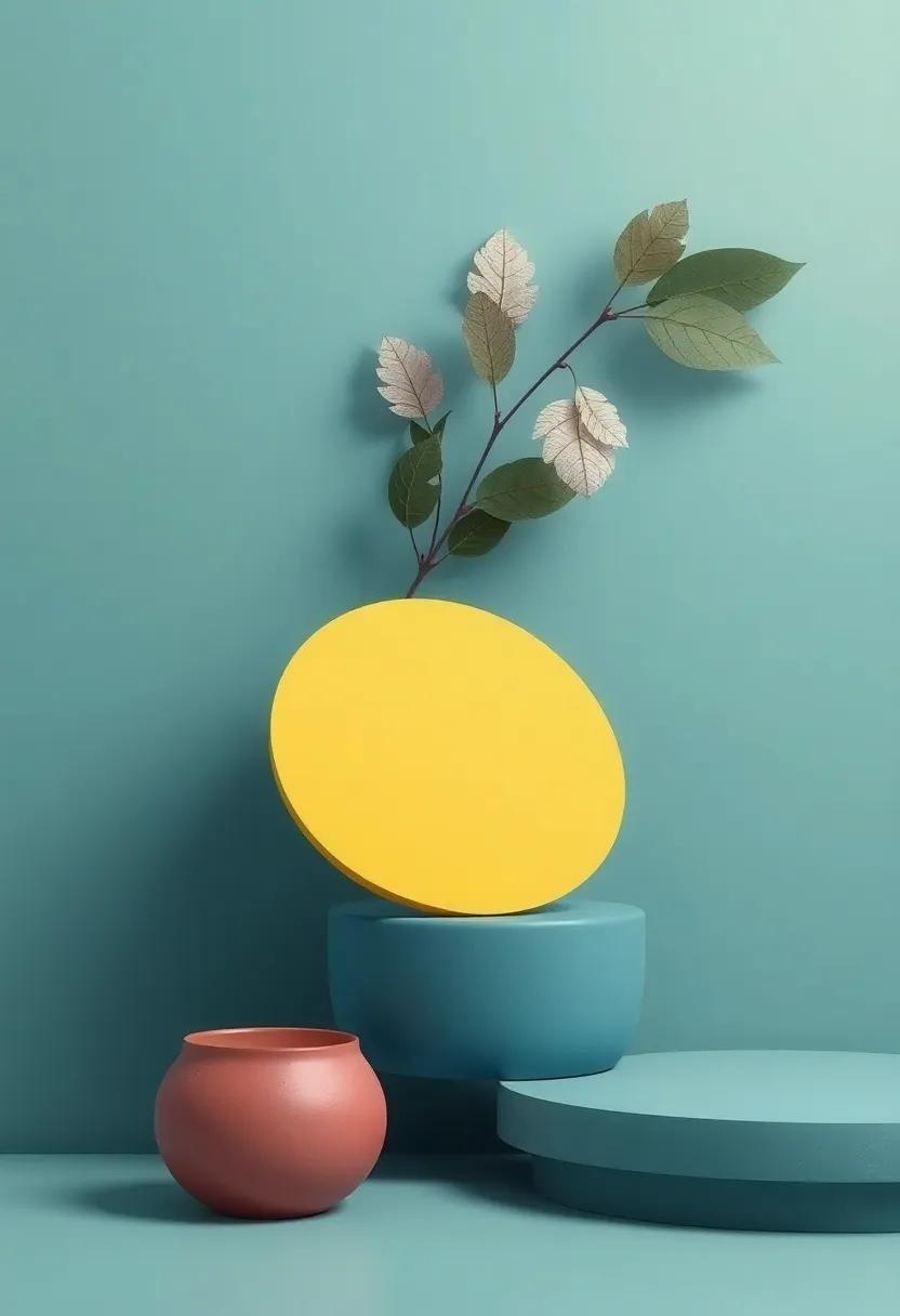
The outdoor world is a vibrant tapestry of colors and textures that can seamlessly inspire our living spaces. Imagine a serene forest; the rich greens of the foliage pair beautifully with earthy browns of the bark and the mellow tones of sunlit clearings. Incorporating these hues within your home can evoke a sense of calmness and connection to nature. Consider using materials like reclaimed wood for furniture, which can introduce warmth and character, while soft textiles in shades of leaf green and sky blue can serve as delightful accents.By blending colors reminiscent of your favorite natural landscapes, you can create an environment that feels both harmonious and rejuvenating.
To enhance this natural design aesthetic even further, focus on the interplay of textures. Elements such as stone, linen, and wool can add depth and tactile warmth to your space, echoing the organic world outside. Combining smooth, polished surfaces with rough-hewn materials—like pairing a sleek granite countertop with rustic wooden cabinets—creates an intriguing contrast that draws the eye. Below is a simple framework for selecting colors and materials inspired by nature:
| Nature Inspiration | Color Palette | Material Choices |
|---|---|---|
| Seaside | Soft blues, sandy tans | Natural fibers, driftwood |
| Mountain | Cool grays, evergreen greens | Stone, leather |
| Garden | Vibrant florals, earthy browns | ceramics, terracotta |
Unconventional Color Combinations: Breaking the Rules with Textures
Color is often seen as a rigid language with predefined rules, but creativity thrives in the spaces where these conventions clash. Embracing unconventional combinations can elevate a design, especially when paired with a captivating texture.Imagine the vibrancy of lime green against the grounding warmth of rusty orange, or the striking contrast of deep navy against tufty plush velvet. These unexpected pairings not only catch the eye but can also evoke a sense of curiosity and depth in a space.
Textures play a vital role in enhancing these unusual color matches. When mixing materials, consider how the feel of each texture complements the hues involved. As an example, a shimmering silk combined with a matte stone creates a dynamic interplay that can transform a simple color palette into a multi-dimensional experience. Elements such as brushed metal, rough wood, or soft leather can sync with your daring color choices, enriching them with emotional resonance and architectural interest.
The Role of Temperature in Color Perception and Material Choice
Temperature substantially influences our perception of color and the subsequent choice of materials, creating a rich tapestry of association and emotional response. Colors can evoke warmth or coolness, shaping the ambiance of a space or product. Warm colors such as reds,oranges,and yellows radiate energy and comfort,often reminiscent of sunlight,while cool colors like blues and greens tend to convey tranquility and calmness,akin to serene water or shade. As a result, the temperature of a color can guide designers in selecting materials that complement these emotional reactions, enhancing the overall experience for the observer.
The choice of materials themselves can further amplify the perceived temperature of colors. As a notable example,glossy surfaces tend to reflect more light,making colors appear brighter and potentially warmer,while matte finishes absorb more light,frequently enough rendering colors cooler and softer. Features like texture and finish can be crucial in reinforcing this relationship. Consider the following pairings that showcase the interaction between color temperature and material selection:
| color Temperature | Material | Effect |
|---|---|---|
| Warm | Wood (Polished) | Inviting and Cozy |
| Cool | Metal (Brushed) | modern and Calm |
| Warm | Textiles (Soft Velvet) | Luxurious Comfort |
| Cool | Glass (Frosted) | Serene and Diffused |
By thoughtfully considering how temperature influences both color and material choice, designers can create a cohesive narrative that resonates with the intended audience. The art lies in balancing these elements to evoke desired emotions and responses, crafting immersive environments that beautifully harmonize hues and textures.
Vintage Meets Modern: Timeless Textures and Bold Hues
In the world of design, the convergence of vintage aesthetics and modern sensibilities creates a captivating dialogue that allows us to explore the richness of textures alongside the vibrancy of colors. Textures from bygone eras evoke a sense of nostalgia, drawing us in with their intricate details and craftsmanship. Unique materials such as raw silk, reclaimed wood, and distressed leather pair beautifully with contemporary elements like sleek metals and bold ceramic glazes. The juxtaposition of these textures not only adds depth but also fosters a harmonious balance that invites tactile engagement.
As we delve deeper into this combination, it’s essential to consider how colors interact with these diverse materials.Bold hues, when thoughtfully chosen, can breathe new life into conventional fabrics and surfaces, creating striking contrasts that enhance visual interest. Take a look at the following spectrum of associations that depict how colors can influence and elevate textures:
| Color | Texture | Emotional Response |
|---|---|---|
| Emerald Green | Velvet | Luxurious, Calm |
| Burnt Orange | weathered Wood | Warmth, Comfort |
| Deep Plum | Leather | Boldness, Intimacy |
| Indigo Blue | Canvas | Stability, Serenity |
The collection of colors and textures not only defines the aesthetic but also influences how we perceive spaces. By daring to blend the old with the new, designers can create environments that are not only visually arresting but also rich in storytelling, inviting occupants to reflect on the past while living fully in the present.
Monochromatic Schemes: The Beauty of Unity in Color and Texture
Monochromatic schemes offer a stunning exploration of how different shades and tints of a single color can evoke a sense of peaceful coherence. By layering various tones, designers can create depth and interest while maintaining an overarching sense of unity. This approach not only enhances visual appeal but also draws attention to textures and materials that might otherwise be overlooked. For instance, consider how a soft blue can appear different when paired with a matte fabric compared to a sleek, glossy finish. The combination amplifies the overall aesthetic,transforming a simple hue into an experience that engages the senses.
Moreover, the beauty of a monochromatic palette lies in its versatility and harmony. By blending varieties of color, one can achieve a balance that feels rich and complete without the chaos that multiple colors may introduce. materials such as wood, metal, and textiles can be utilized in varying shades, creating a dialogue that speaks to both the eyes and the touch. To visualize this, consider the following table showcasing how different textures can influence a single color scheme:
| Color | texture | emotional Response |
|---|---|---|
| Serene Blue | Soft Velvet | Calmness |
| Serene Blue | Crafted Wood | Warmth |
| Serene Blue | Glossy Ceramic | Elegance |
Textures as Focal Points: When Color Takes a Backseat
When the richness of texture takes the spotlight, the vibrancy of color often recedes into the background. This phenomenon allows materials to speak for themselves, showcasing their inherent qualities and captivating the eye through touch and visual intrigue. Consider the following textures that dominate with their tactile presence:
- Rough stone: Adds a natural, rustic charm.
- Soft velvet: Introduces an element of luxury.
- Weathered wood: Evokes warmth and authenticity.
- Metals with patina: Infuses richness and depth.
In spaces where the emphasis is on texture, subtle hues can enhance rather than compete with the material’s narrative. By selecting muted or neutral tones, designers can create an environment that invites exploration through its surfaces, offering both visual and tactile experiences. This interplay can be mapped out using the following simple concepts:
| Texture Type | color Pairing |
|---|---|
| Brushed concrete | Soft Gray |
| Woven Fabrics | Muted Earth Tones |
| Glossy Ceramic | Pastel Shades |
| Rugged Leather | Warm Neutrals |
Mood Boards: Crafting Cohesion Through Colors and Materials
in the realm of design, a mood board serves as a visual canvas where colors and materials collide, establishing a foundation of coherence. By curating a collection of textures, hues, and designs, designers can evoke emotions and tell a story that resonates with the intended audience. The interplay between color and material creates a dialogue that can transform spaces; as a notable example,a blend of warm earthy tones and natural woods can impart a sense of comfort,while cool,metallic shades paired with glass might create a more modern and sophisticated ambiance. Each choice has the power to influence perceptions,so selecting materials that echo the characteristic tones is crucial for a harmonious blend.
In crafting these visual experiences, one can explore various combinations to highlight the relationship between colors and materials. Consider these elements when assembling your mood board:
- Color Palette: Choose a base color and find complementary shades.
- Material Contrast: Mix smooth and rough textures for visual interest.
- Lighting Effects: Test how colors shift with different light sources.
- Theme Consistency: Ensure that all elements reflect a unified concept.
| Color | Recommended Materials |
|---|---|
| Soft pastels | Cotton, Linen |
| Bold jewel Tones | Velvet, Brass |
| Neutral Shades | Concrete, Wood |
| Vibrant Primaries | plastic, Glass |
Seasonal Shifts: Adapting Color and Texture to Changing Environments
As the seasons transition, our surroundings undergo a remarkable transformation that calls for a thoughtful response in design. Embracing these changes in color and texture allows us to create spaces that resonate with nature’s rhythms. As a notable example,as autumn approaches,rich oranges,deep reds,and earthy browns can enhance the warm,cozy atmosphere in your home. This transition not only represents the season but also invites a tactile experience through the introduction of softer fabrics, such as velvets and wools, that provide comfort as the temperatures drop.
In contrast, spring beckons with a palette bursting with life—soft pastels and vibrant blooms that breathe freshness into interiors. Fabrics used during this time can shift towards lighter materials like cottons and linens, accentuating airy, breezy environments. To further illustrate the synergy between seasonal transitions and design choices, observe the following table that encapsulates color and texture pairings suited for varying seasons:
| season | Color Palette | Texture Styles |
|---|---|---|
| Autumn | Oranges, Reds, Browns | Velvets, Wools |
| Winter | Whites, Grays, Deep Blues | Knits, Faux Fur |
| Spring | Pinks, Greens, Yellows | Cottons, Linens |
| Summer | Bright Blues, Corals, Bright Yellows | Lightweight Carringtons, Textured Canvas |
By selecting appropriate hues and textures reflective of each season’s character, we cultivate spaces that evoke emotional and sensory connections. This alignment not only enhances aesthetic appeal but also fosters a deeper appreciation for the natural world around us, allowing us to feel the essence of each season permeate our living environments.
The Psychology of Color: How Material choices Affect Perception
The intricate dance between color and material is a fundamental element of our visual experience. Warm hues like reds and oranges tend to evoke feelings of excitement and warmth, seamlessly complementing materials such as wood and wool, which contribute to a sense of coziness. In contrast, cool colors such as blues and greens project tranquility and calmness, notably when paired with materials like glass or metal. By engaging the senses, the right combination can create a powerful emotional resonance, drawing the observer into a deeper interaction with the space.This synergy allows designers and homeowners alike to curate atmospheres that either stimulate conversation or encourage introspection.
moreover, certain color-material combinations hold cultural significance that shapes our perception. For instance, in many Eastern cultures, red fabrics symbolize prosperity and joy, making them a popular choice for celebrations. Conversely, the use of neutral materials alongside pastel palettes often conveys elegance and sophistication, appealing to contemporary design sensibilities. understanding these relationships can be pivotal in design, as the following table illustrates some examples of color and material pairings with their psychological implications:
| Color | Material | Psychological Effect |
|---|---|---|
| Red | Wood | Warmth, energy |
| Blue | glass | Calm, clarity |
| yellow | Metal | Positivity, cheerfulness |
| Green | Textiles | Harmony, nature |
Designing with Contrast: Bold colors Against subtle Textures
When it comes to creating visual interest, the juxtaposition of vivid colors with understated textures can produce striking designs that capture attention. Bold colors, such as deep blues, vibrant reds, and sunny yellows, stand out splendidly against soft textures like linen, matte finishes, or brushed metals. This combination not only enhances the vibrancy of the colors but also adds depth to the overall aesthetic. Consider the impact of a rich emerald green featuring prominently on a backdrop of lightly woven canvas; the result is both lively and sophisticated, inviting the viewer to explore the nuances of the materials used.
To effectively harness this dynamic, it’s essential to balance weight and brightness in your design choices.A thoughtfully curated palette allows for exploration, such as pairing dark hues with tactile surfaces like terracotta or natural wood grain. Features to consider include:
- Color contrast: Striking a balance between light and dark shades.
- Material variety: Mixing smooth, rough, glossy, and matte textures.
- Functional Spaces: Enhancing atmospheres in different rooms or areas.
When harmonizing colors and materials, experimenting with different combinations can lead to unexpected but pleasing results. Below is a simple guide to inspire your palette selection:
| Color | Texture | Emotional Effect |
|---|---|---|
| Crimson | Satin | Passion & Energy |
| Turquoise | Soft Velvet | Calm & relaxation |
| Mustard Yellow | Natural Fiber | Warmth & Comfort |
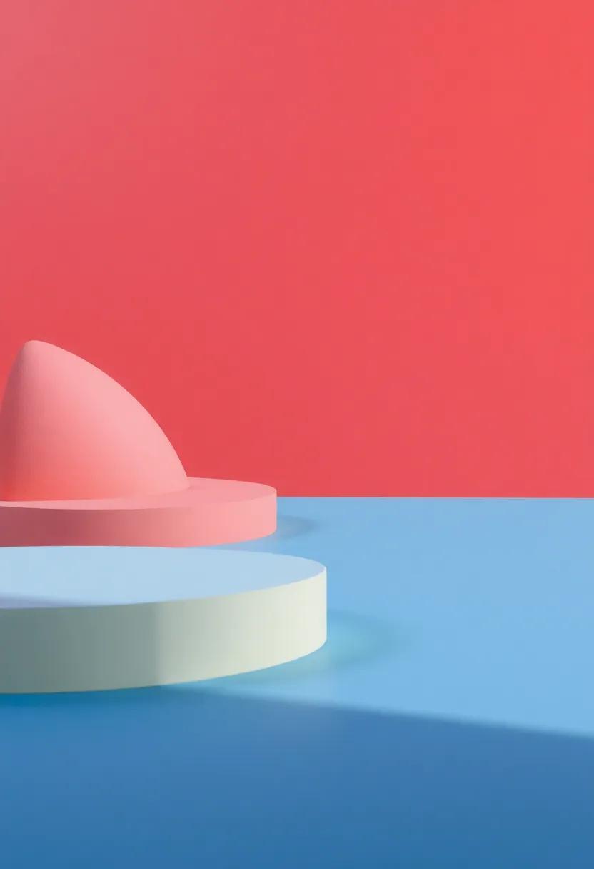
Finding Balance: Harmonizing Softness and Sharpness in Design

In the world of design,achieving a seamless blend of softness and sharpness can significantly elevate the visual appeal of any project. The juxtaposition of gentle curves and crisp lines creates a dynamic environment where the eye is drawn and held. When selecting materials, consider incorporating a variety of textures that provoke different sensory experiences. For instance, a matte finish can enhance softness, while a glossy surface brings forth a sharper aesthetic. The interplay between these qualities not only accentuates individual elements but also contributes to an overall feeling of unity within the space.
To effectively illustrate this relationship, designers often turn to color palettes that reflect both softness and sharpness. A harmonious color scheme can serve as the backbone of this balance, allowing each element to shine without overwhelming the senses. By utilizing a blend of muted tones alongside vivid accents, a harmonious atmosphere can be cultivated. Below is a quick guide to effective color pairing that respects both softness and sharpness:
| Soft Colors | Sharp Accents |
|---|---|
| Pastel Blue | Cobalt Blue |
| Soft Peach | Coral Red |
| Muted Green | Emerald Green |
| Light Lavender | Rich Purple |
Translating Nature’s Elements into Color and Material Harmony
Drawing inspiration from the natural world opens up a treasure trove of colors and textures that can transform any space into a harmonious oasis. Earth, with its rich browns and greens, can be beautifully represented through earthy materials such as reclaimed wood and stone, which not only add warmth but also offer a tactile experience that echoes the environment. Similarly, water can inspire serene palettes of blues and greens, translating into materials like glass and smooth ceramic that mimic the fluidity and reflective qualities of rivers or oceans. When thoughtfully combined, these elements illustrate how nature’s palette can enhance our living spaces, creating a cohesive narrative that resonates with our innate connections to the environment.
Moreover, elements like fire and air can play pivotal roles in this exploration of harmony. Warm hues of red and orange can be embodied in fabrics such as velvets or silks, which invite comfort and energy, reminiscent of flickering flames. Conversely, airy tones of soft whites and pastels can be reflected through lightweight, sheer materials that promote an open and breezy feel, perfect for creating a sense of spaciousness. By understanding these relationships, designers and homeowners can cultivate environments that feel balanced and vibrant, drawing on the very essence of nature to enrich their aesthetic choices.
Cultural Narratives: Colors and Textures that Tell a Story
Colors and textures are the silent storytellers woven into the fabric of every culture, creating a vivid tapestry that reflects history, tradition, and emotion. Rich earthy tones evoke the spirit of ancient landscapes, while vibrant hues mirror the exuberance of festivals and celebrations. Within textiles, such as handcrafted tapestries or intricately dyed fabrics, the interplay of color and texture encapsulates narratives—from the struggles and triumphs of communities to their daily rituals. Each stitch and shade is a brushstroke on the canvas of cultural identity, connecting generations and bridging divides through shared experiences.
In various cultures, materials are imbued with symbolic meaning, enhancing the stories told by their colors. For instance, silks from the East often glisten in luminous golds and reds, representing prosperity and fortune, while woven rugs from tribal regions showcase deep blues and burnt oranges, signaling the resilience and warmth of familial bonds. The significance of these colors and materials can be summarized in the following table:
| Color | Material | Symbolism |
|---|---|---|
| Gold | Silk | Prosperity |
| Red | Cotton | Passion |
| Blue | Wool | Wisdom |
| Orange | Jute | Warmth |
This intricate dance between colors and textures creates a cultural narrative that is both profound and beautifully intricate. As we explore these relationships, we begin to understand how every shade invites us into a story waiting to be told, illuminating the rich spectrum of human experience.
Translucence and Layering: Enhancing Visual Appeal Through Textures
Translucence is a powerful tool in design, offering a glimpse into the layers beneath while projecting an ethereal quality. Utilizing materials that allow light to pass through, such as frosted glass or sheer fabrics, can create depth and intrigue in any space.When combined with various textures, translucence becomes a canvas for light and shadow, enhancing the overall aesthetic. Here are some ways to effectively incorporate translucence and layering into your designs:
- Layered Textiles: Combine sheer curtains with heavier drapes for a dynamic interplay of light and opacity.
- Glass Elements: Use partition walls that incorporate translucent panels to divide spaces without sacrificing openness.
- Gradient Effects: Integrate gradients in both color and transparency to create a sense of movement and fluidity in design.
Furthermore, layering different materials not only adds visual appeal but also enhances tactile experiences. By juxtaposing soft textures with more rigid surfaces, designers can create compelling contrasts that draw the eye and invite touch. For example, a plush velvet sofa paired with sleek marble accents can convey luxury while maintaining a balanced dialogue between softness and structure. Below is a simple table showcasing some effective material combinations:
| Material | Texture | Visual Effect |
|---|---|---|
| Wood | Rough | warmth and Earthiness |
| Glass | Smooth | Clarity and Lightness |
| Fabric | Soft | Cozy and Inviting |
Sustainable Design: Eco-Friendly Materials and Their Color Applications
In the realm of design, the synergy between color and material has become a cornerstone of sustainable practices, urging designers to consider not just aesthetics but also the environmental impact of their choices. Eco-friendly materials like bamboo, recycled metal, natural fibers, and low-VOC paints offer a palette that’s both vibrant and responsible.By embracing these materials, designers can achieve a spectrum of hues that tell a story of sustainability while enhancing the overall ambiance of a space. As a notable example, the warm tones of reclaimed wood can be paired with the earthy greens of hemp textiles, creating a visually pleasing and sustainable environment that resonates with those who enter.
The application of colors derived from eco-friendly materials challenges traditional perceptions of design, allowing for innovative combinations that reflect a commitment to the planet. Here are some popular eco-friendly materials and their versatile color applications:
| Material | Color Spectrum |
|---|---|
| bamboo | Warm golds, rich browns |
| Recycled Metal | industrial grays, deep blues |
| Natural Fibers | Earthy greens, soft beiges |
| Low-VOC Paints | Vibrant pastels, muted tones |
These material-color relationships not only beautify spaces but also enhance the dialogue around sustainable practices.For example, the lush greens of natural fiber textiles harmonize effortlessly with the understated elegance of bamboo furniture, creating a serene environment dedicated to eco-conscious living. By thoughtfully selecting colors that complement eco-friendly materials, designers can cultivate spaces that are not only visually captivating but also aligned with the values of sustainability and environmental stewardship.
Final Thoughts
As we draw the curtain on our exploration of the compelling relationship between colors and materials, it becomes evident that the harmony of hues and textures is not just an aesthetic endeavor, but a profound dialogue that shapes our sensory experience. Each shade we embrace, each texture we caress, tells a story—one that transcends mere visuals to evoke emotion, memory, and connection.
Through carefully curated palettes and thoughtfully selected materials, we create environments that resonate with our deepest sensibilities, inviting us to engage more fully with our surroundings. Whether in art, fashion, or design, the symbiosis of color and texture goes beyond the superficial; it enriches our lives in subtle yet impactful ways, reminding us that beauty lies not just in singular elements, but in the intricate interplay between them.
As we continue to refine our understanding of this relationship, let us remain curious and open-minded, delighting in the endless possibilities that await within the spectrum of colors and the tactile nature of materials. In this fusion, we find not only inspiration but a richer tapestry of life itself, woven together by the threads of creativity and perception.