46 Stylish Bathroom Color Schemes to Transform Compact, Contemporary, and Vibrant Spaces
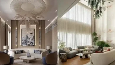
Bathroom interiors are evolving dramatically, showcasing colors as the central element in crafting personal retreat spaces. Homeowners across the United States are stepping away from traditional neutral tones and welcoming a spectrum that ranges from grounded earthy terracotta hues to striking charcoal shades. The trend reflects a desire for bathrooms that mirror unique personality and promote wellness. On platforms like Pinterest, searches peak for bathrooms that achieve a delicate harmony between tranquility and individuality—whether it’s a guest powder room boosted with bold jewel colors or a master bath enveloped in verdant botanical greens. This comprehensive overview introduces 23 captivating color schemes blending enduring charm with innovative palettes suited to bathrooms of any dimension or style.
Rejuvenate Compact Bathrooms with Gentle Sage
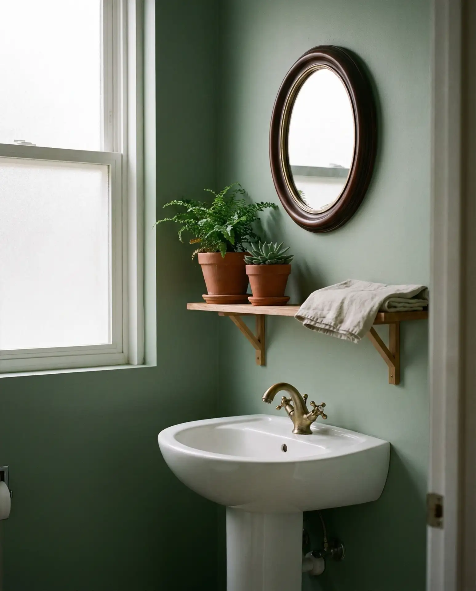
Subtle sage green tones create a soothing ambiance ideal for smaller bathrooms, especially powder rooms with minimal natural light. This subdued green hue radiates warmth while maintaining a fresh, spacious feel. Complement the walls with crisp white molding and brass hardware for a look that merges contemporary style with organic comfort, transforming even modest arrangements into serene sanctuaries. 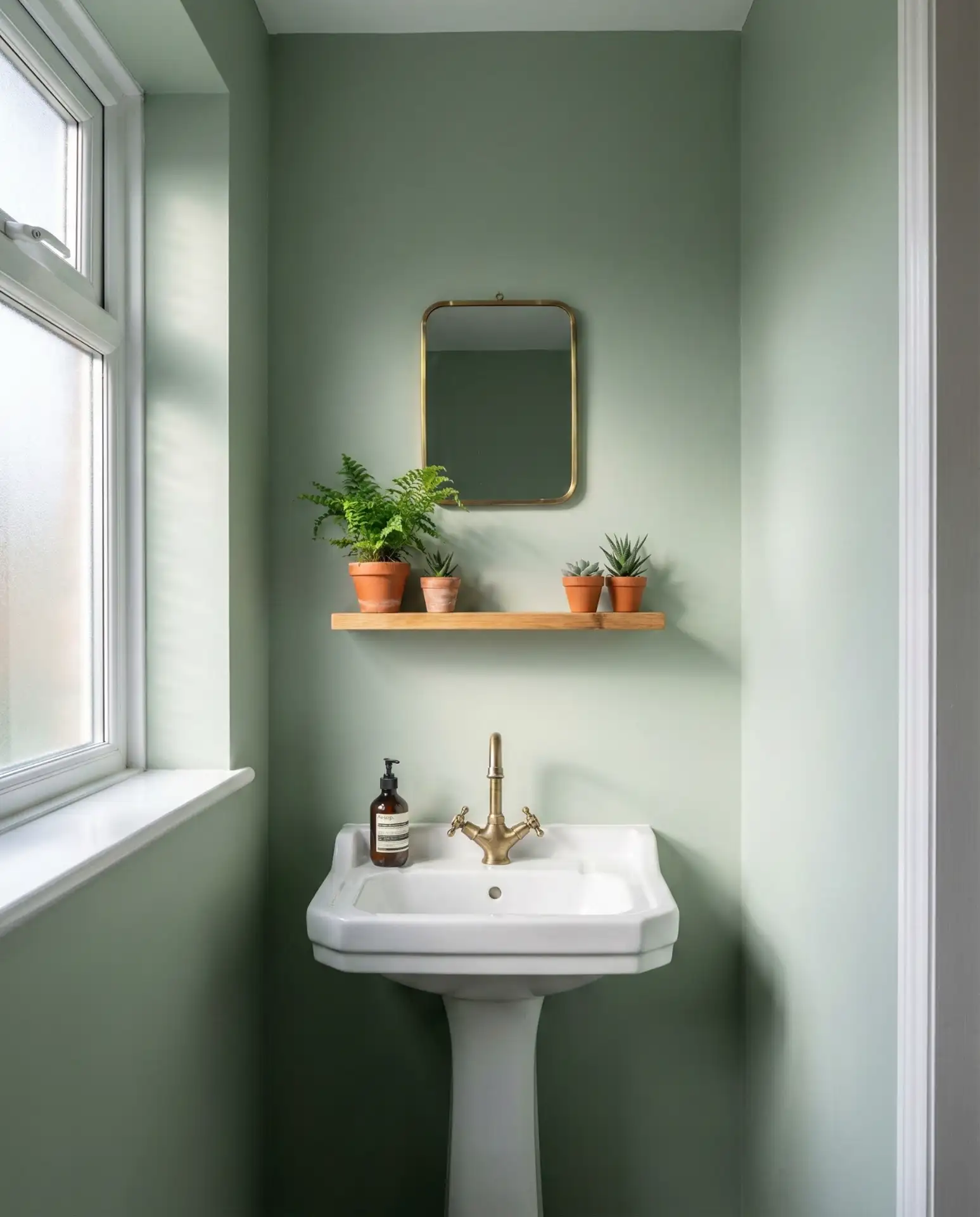
This color story excels when paired with classic white subway tiles or beadboard wainscoting, allowing the green to glow without being overwhelmed by competing textures. Designers often recommend viewing samples at different times throughout the day, as sage subtly evolves under varying light conditions. For DIY novices, it’s a forgiving tone that masks imperfections yet photographs elegantly—qualities favorable for increasing resale appeal.
Statement-Making Charcoal Gray Vanity Matched with White Marble
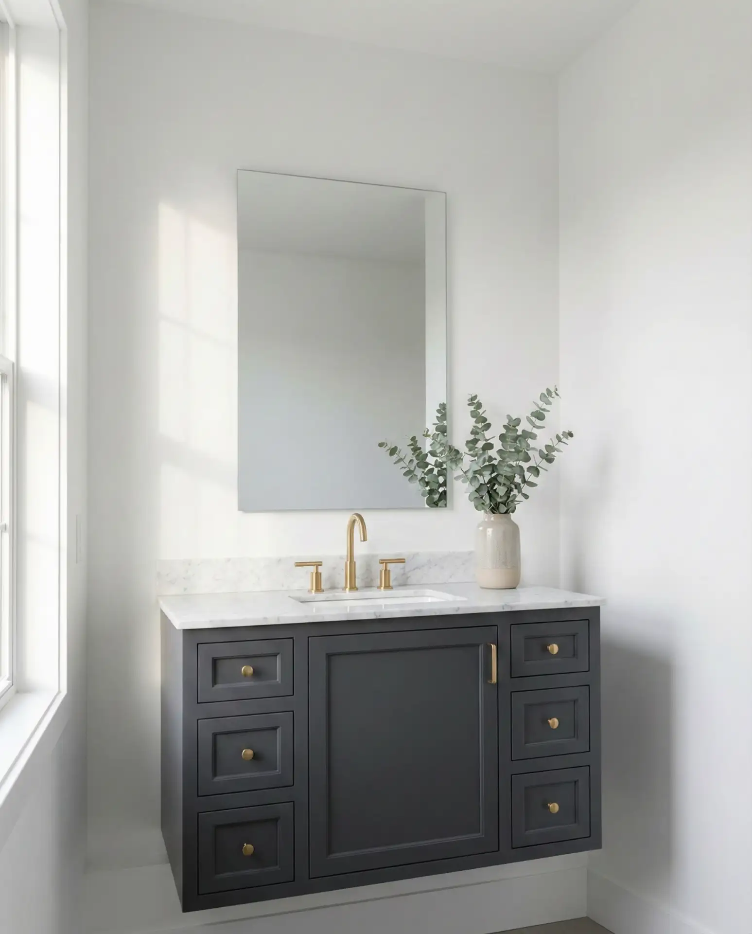
A deep charcoal vanity exudes sophistication when combined with white marble counters, offering a dynamic yet balanced contrast in bathroom design. This pairing injects a sculptural essence into contemporary baths, anchoring the space while the veining of the marble uplifts the overall aesthetic, ensuring a luxurious vibe—ideal for primary bathrooms desiring a focal statement. 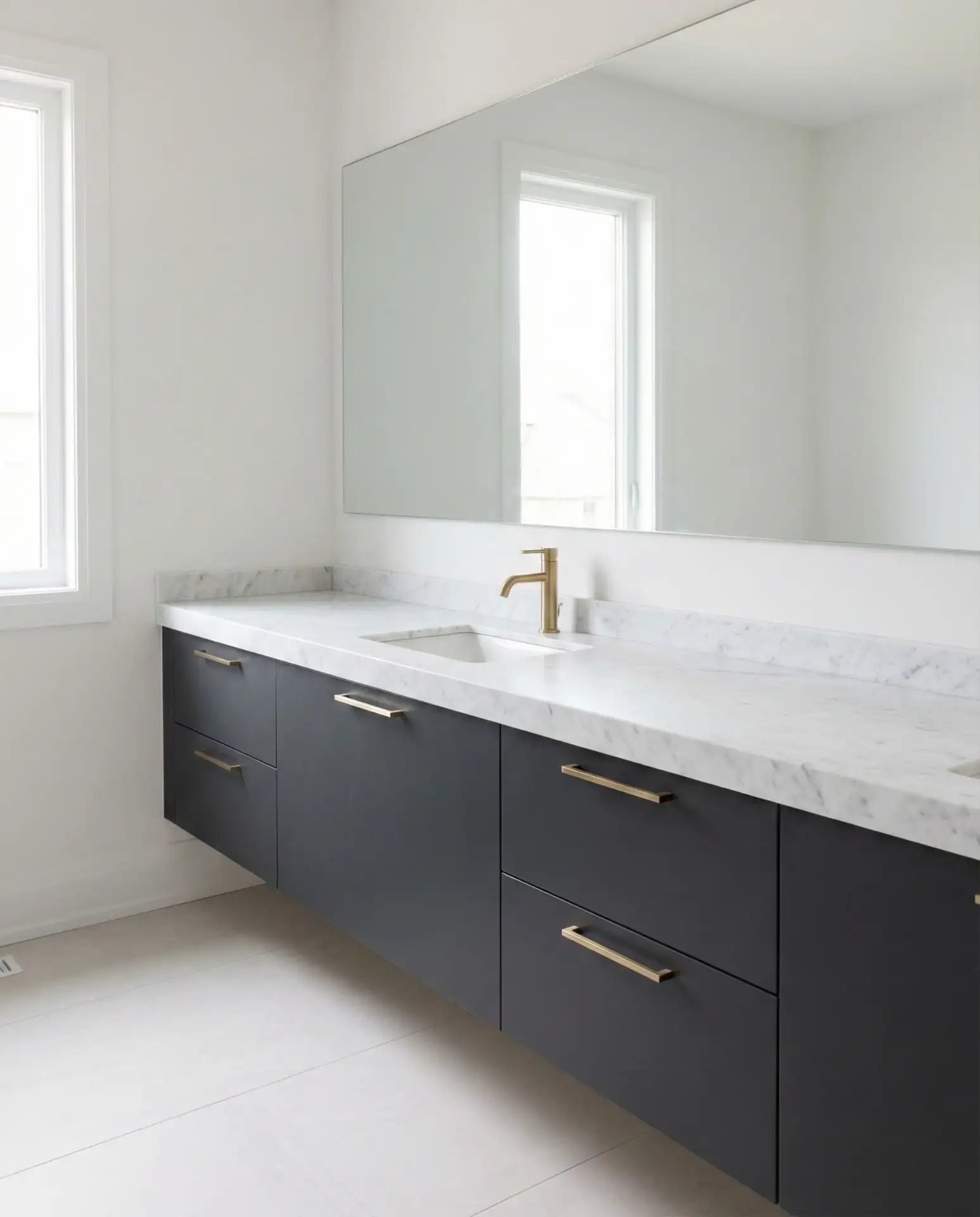
Avoid choosing charcoals infused with blue undertones, as artificial lighting may impart a chilly atmosphere. Instead, seek charcoals with warm brown or subtle green undertones that glow invitingly in typical bathroom illumination. This thoughtful selection prevents a sterile mood, welcoming homeowners with a cozy environment at any time.
Introducing a Rustic Terracotta Accent Wall
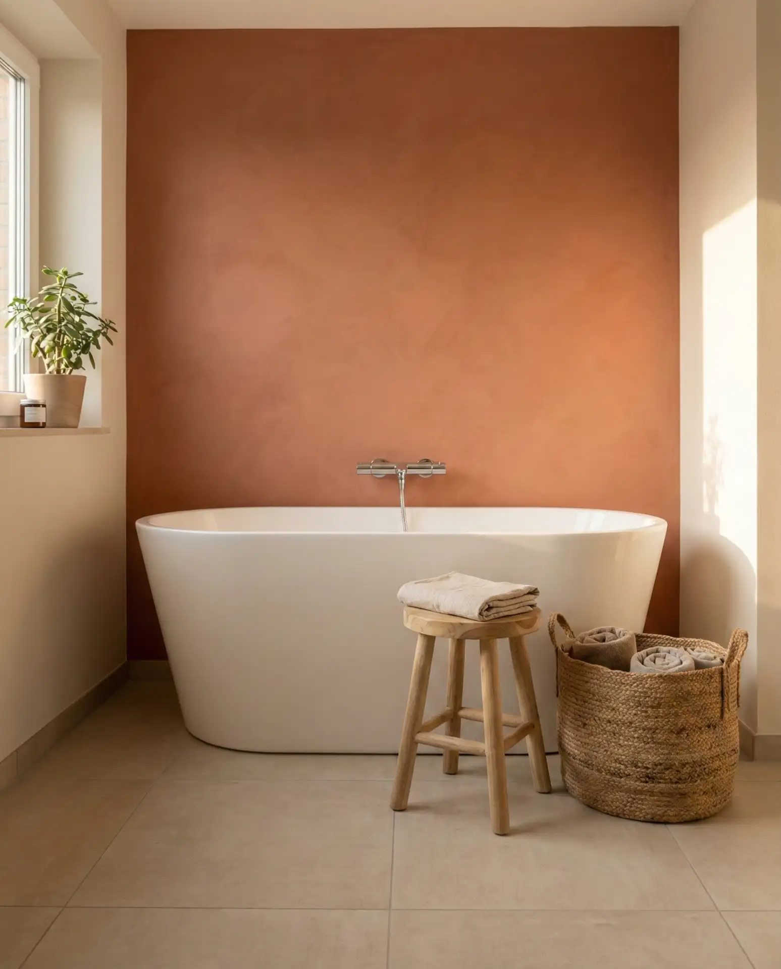
Incorporating a terracotta accent wall infuses an earthy depth evocative of sun-soaked desert landscapes, creating a warm anchor without overwhelming the bathroom with color. This bold yet natural hue shines behind a freestanding tub or vanity area, linking interiors with Southwestern inspiration. It harmonizes elegantly with soft beiges and ivory shades, making it a standout choice for guest bathrooms seeking charm without excess. 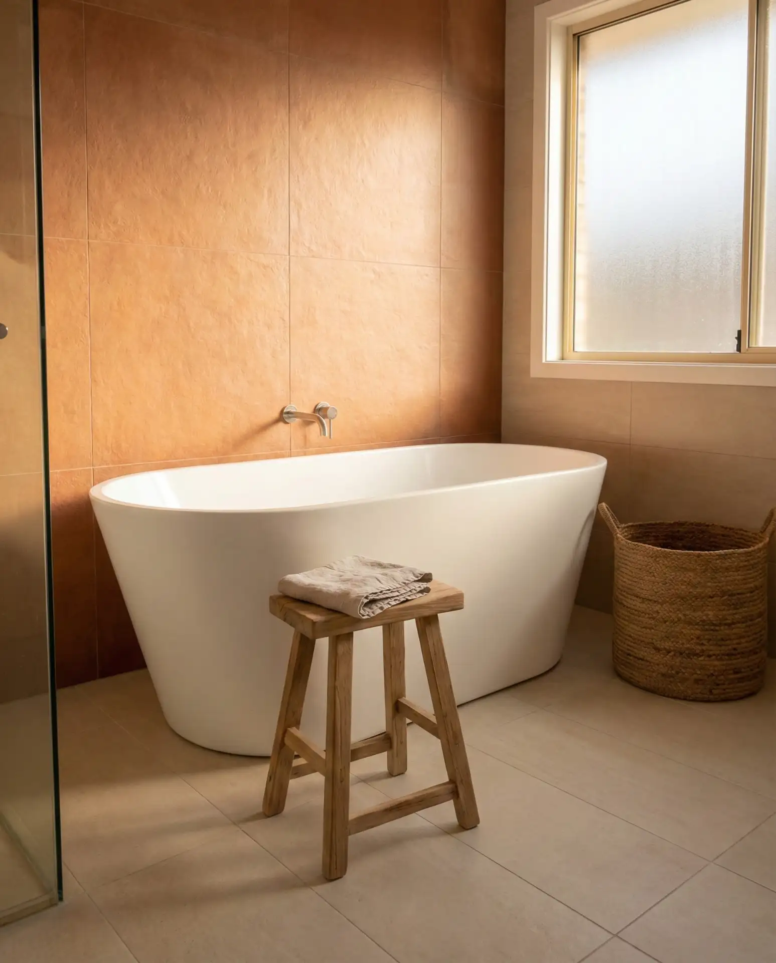
This palette finds particular resonance in southwestern states, where its authenticity aligns with the surrounding environment. Homeowners experimenting with limited terracotta touches, such as behind a tub, report a spa-like vibe that feels timelessly personal rather than fleetingly trendy.
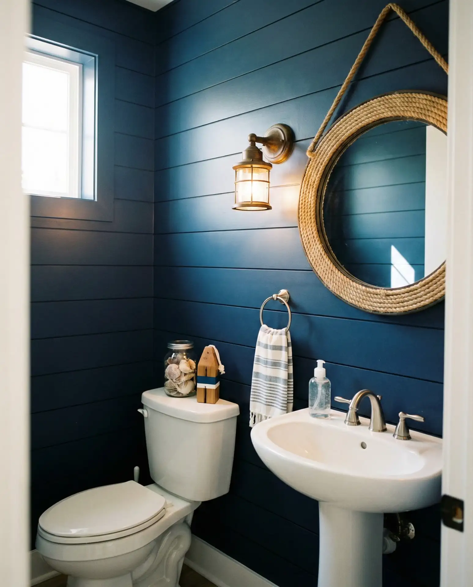
Coastal Elegance: Navy Blue Shiplap in Half Baths
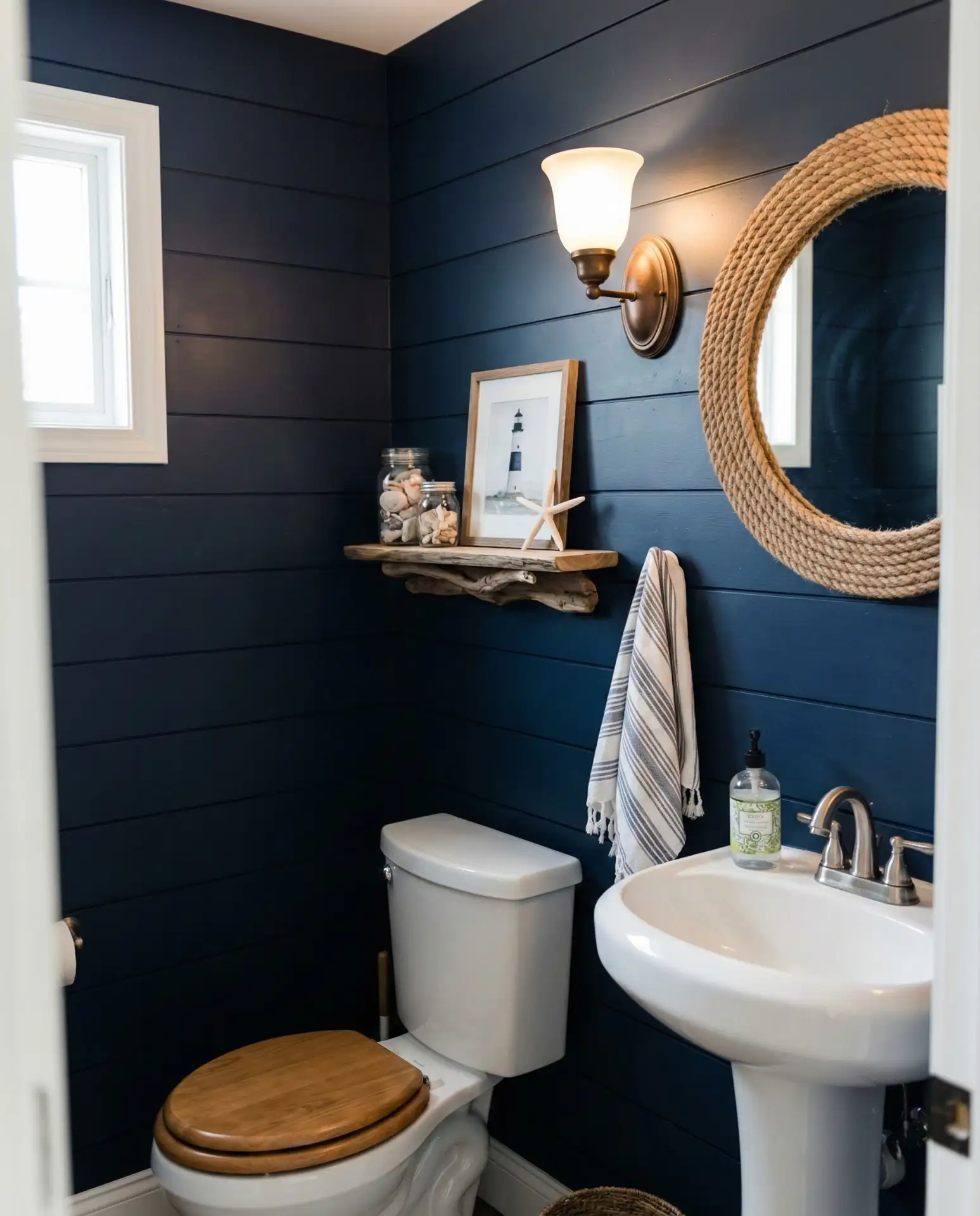
Transform powder rooms with navy blue shiplap paneling that strikes a perfect balance between contemporary and farmhouse aesthetics. Depending on your choice of hardware—shiny chrome for modern flair or oil-rubbed bronze for rustic warmth—navy shiplap adds texture and depth to compact spaces, making the room feel thoughtfully curated rather than an afterthought. 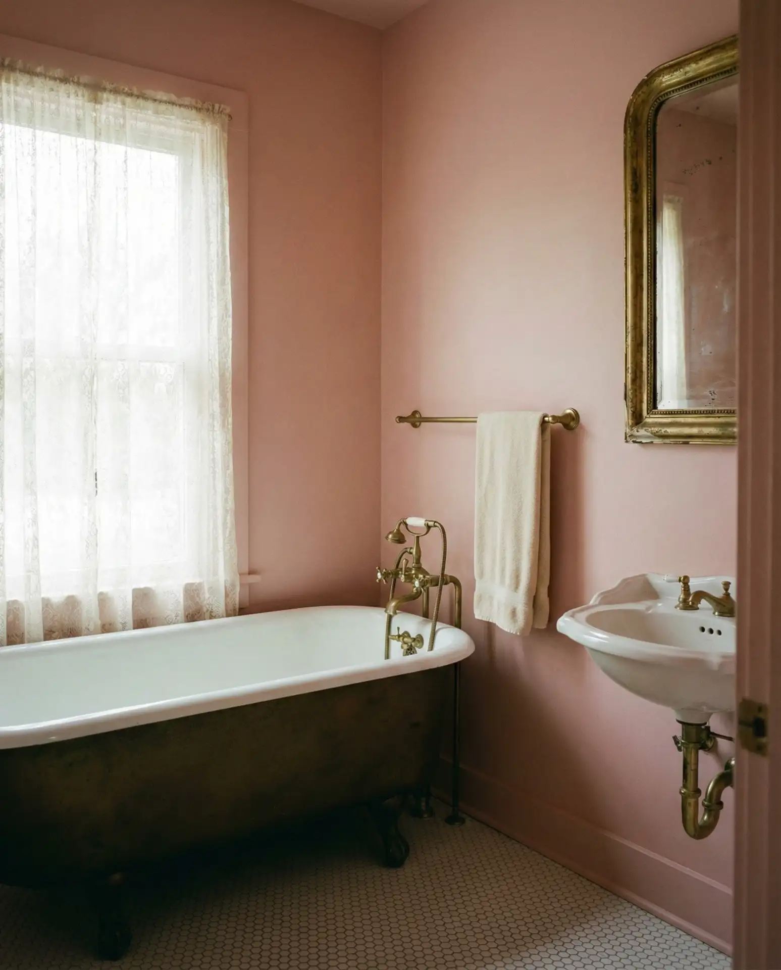
Budget-conscious DIYers often find shiplap upgrades feasible, with material costs between $200-$400 for typical half baths. Pre-primed boards streamline installation time, and the darker navy shade efficiently conceals slight imperfections, offering a high-impact, achievable accent wall.
Romantic Blush Pink Enhanced by Brass Hardware
Embracing blush pink as a calming yet unique alternative neutral has gained momentum, especially in retro-inspired bathrooms. This gentle, muted rose tone imparts warmth and sophistication complemented perfectly by vintage-style brass fixtures, exuding a glamorous old-Hollywood essence. In front of mirrors, this shade flatters skin tones and offers photogenic qualities favored by design-forward homeowners. 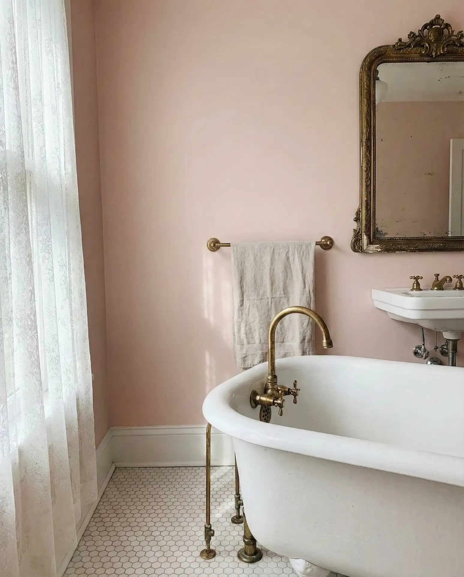
Optimal in spaces with ample sunlight or southern exposures, the color maintains its soft and romantic nature. Rooms facing north may benefit from warmer blush variants to avoid an overly pale or washed-out appearance. Combining blush with white marble or subway tiles keeps the overall scheme refined and cohesive.
Forest Green Cabinetry: Bold and Timeless
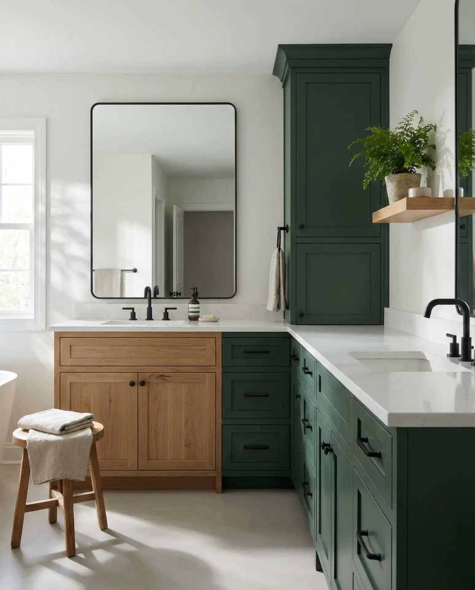
Strong homeowner feedback confirms that green cabinetry, especially in a rich forest green shade, rarely disappoints—though many wish they had selected a more daring tone initially. Choosing a saturated forest green instead of muted olive prevents a dated impression. Sampling against your own lighting and surroundings ensures the vibrant jewel-like saturation you desire, infusing baths with deep color that ages gracefully. 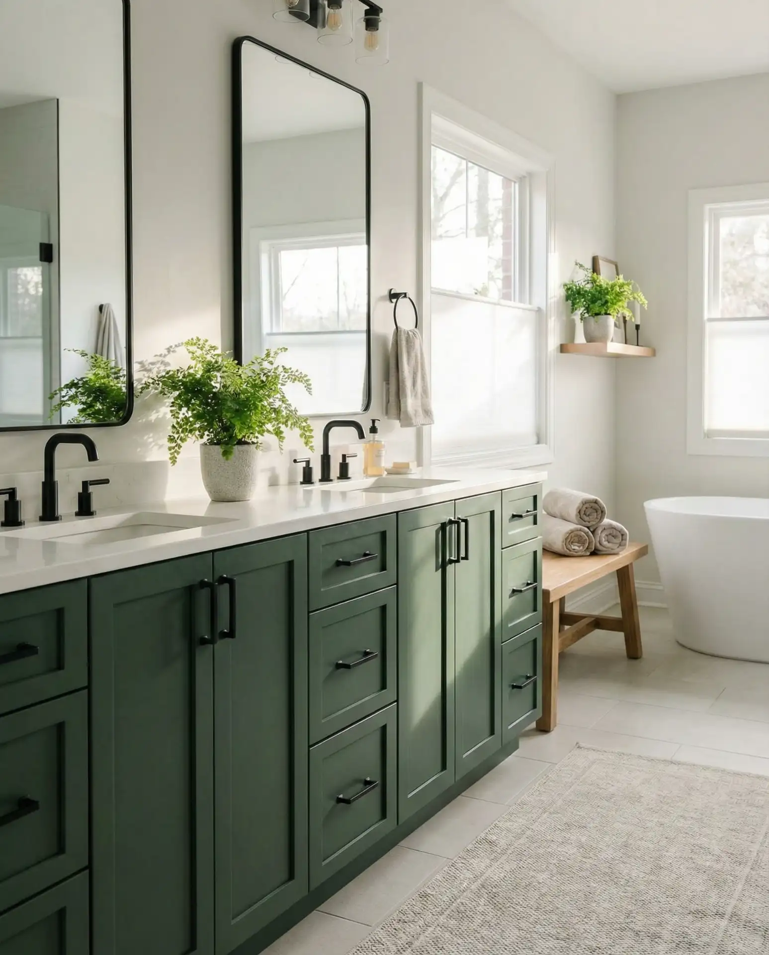
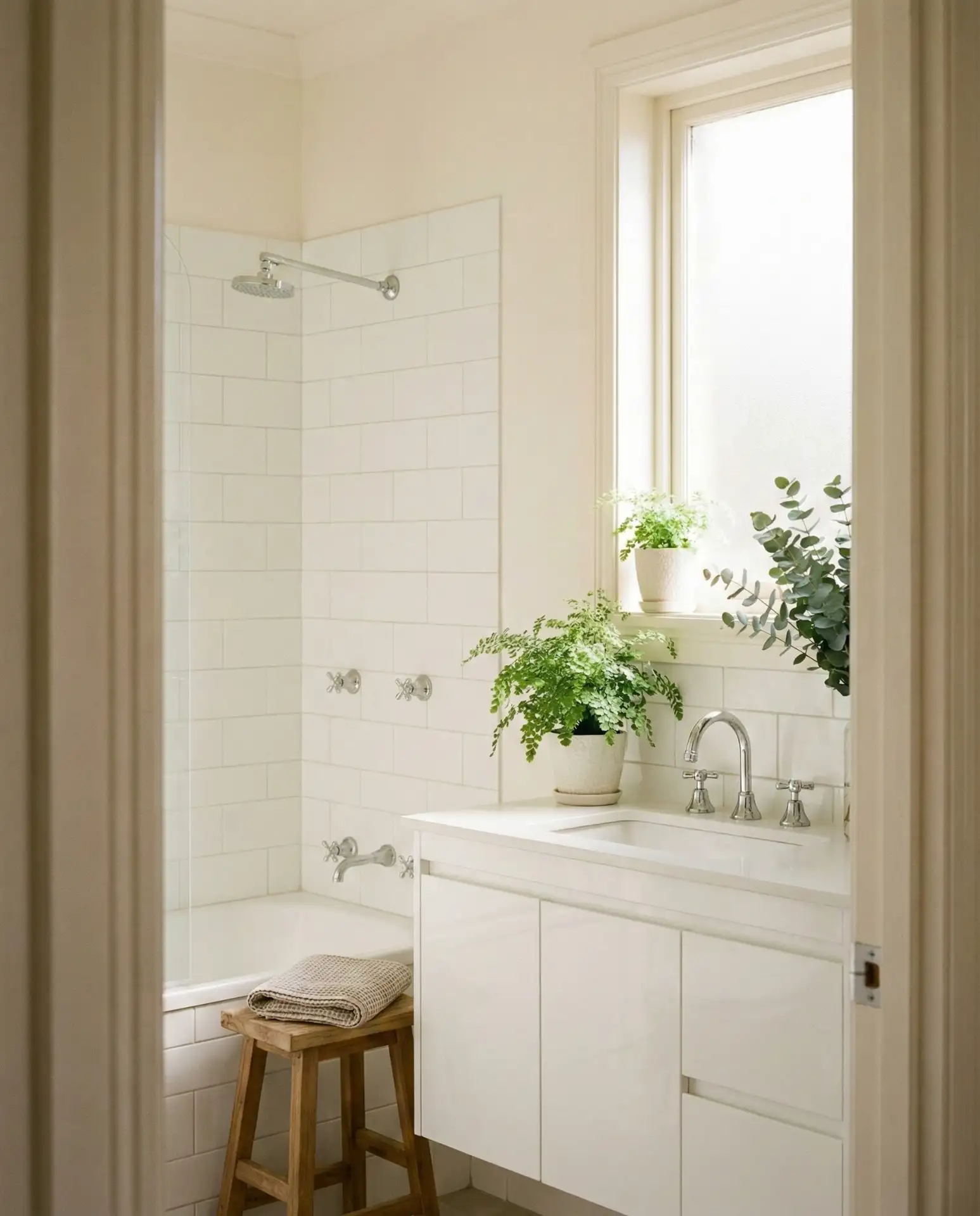
Bright Whites Paired with Inviting Wood Elements
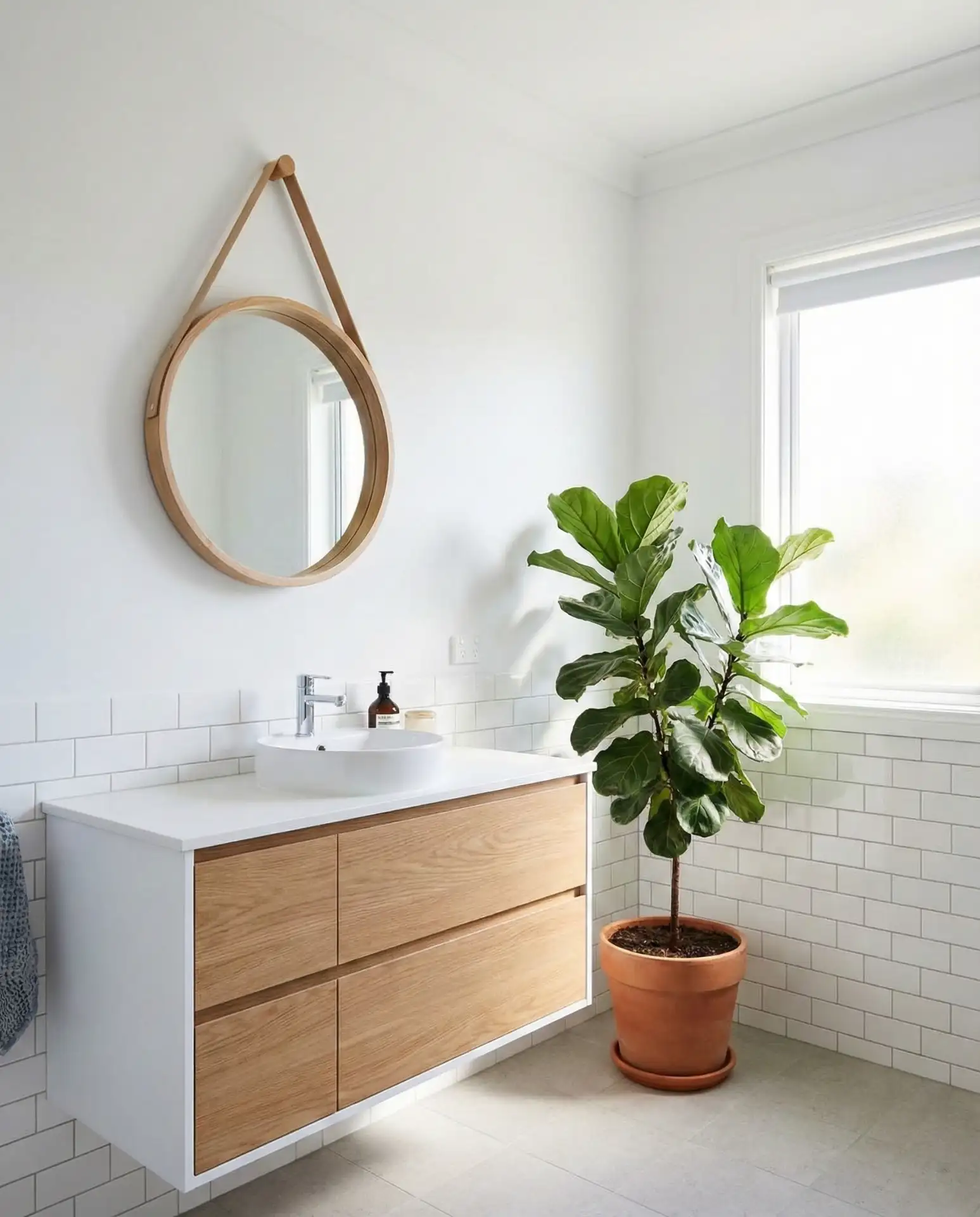
Classic white walls never go out of style, especially when balanced by warm wood accents like vanities, shelving, or mirror frames. This blend crafts a versatile and welcoming atmosphere that transcends design categories by combining rustic charm and modern simplicity. The wooden accents gently combat the clinical tendency of all-white spaces, adding natural textures for comfort and visual interest. 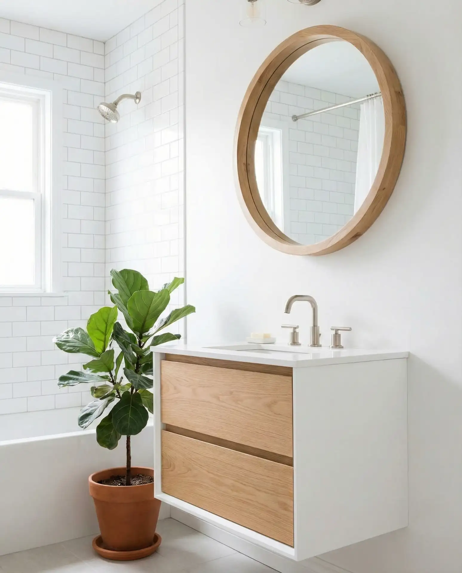
Regions such as the Pacific Northwest and New England embrace this aesthetic for its cozy yet luminous qualities. Cost-conscious remodelers appreciate its budget friendliness, as walls can be painted easily and wood pieces sourced affordably from stores like CB2 or West Elm alternatives.
Moody Black Backdrops with Luxe Gold Highlights
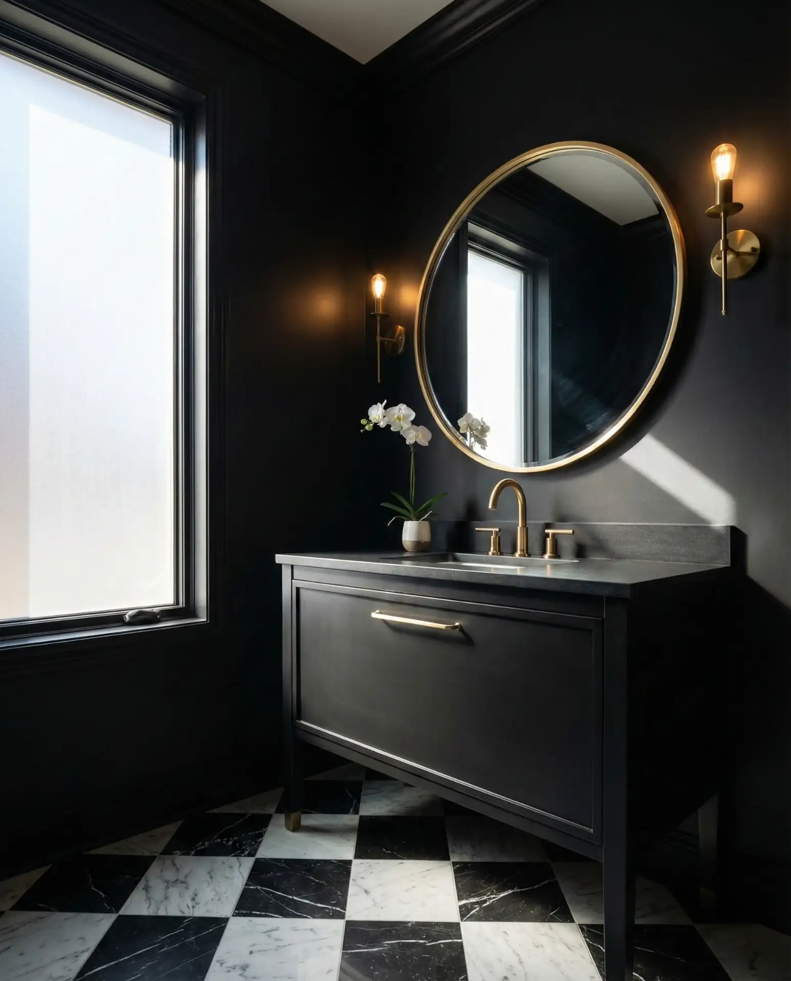
Deep black painted walls create an intense, sophisticated atmosphere, elevating a bathroom from functional to dramatic haven. When offset with gold or brass fixtures, the environment shifts from oppressive to sumptuous. This daring design works best in smaller spaces like half baths where the boldness adds character without daily fatigue. 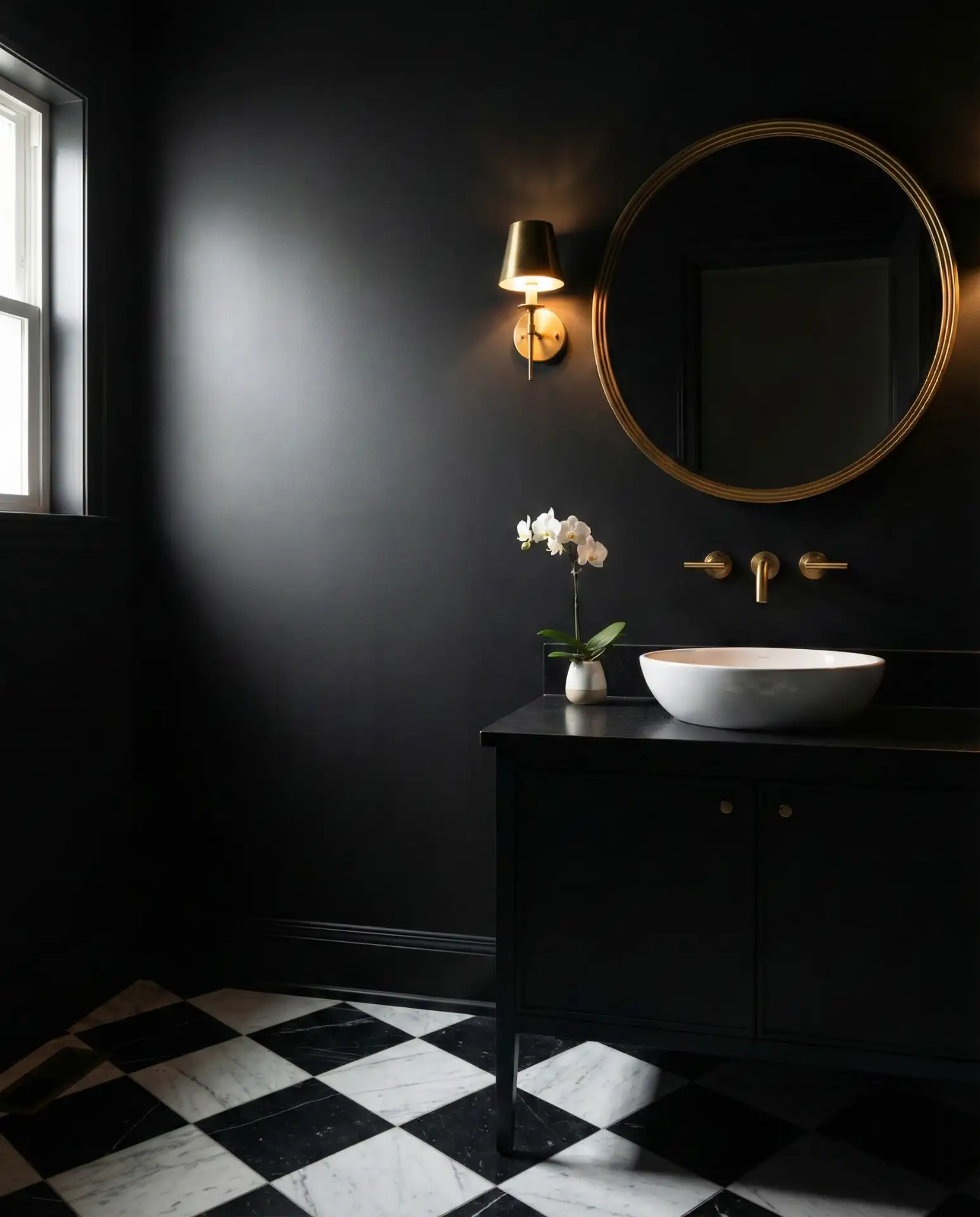
Design pros recommend matte or flat finishes to minimize the visibility of water splashes and fingerprints, while semi-gloss can accentuate trim for subtle contrast. Layered lighting strategies involving sconces, pendant lamps, and candles prevent the space from feeling cavernous and welcome an inviting glow.
Serene Blue-Gray Tones for Calm Coastal Feelings
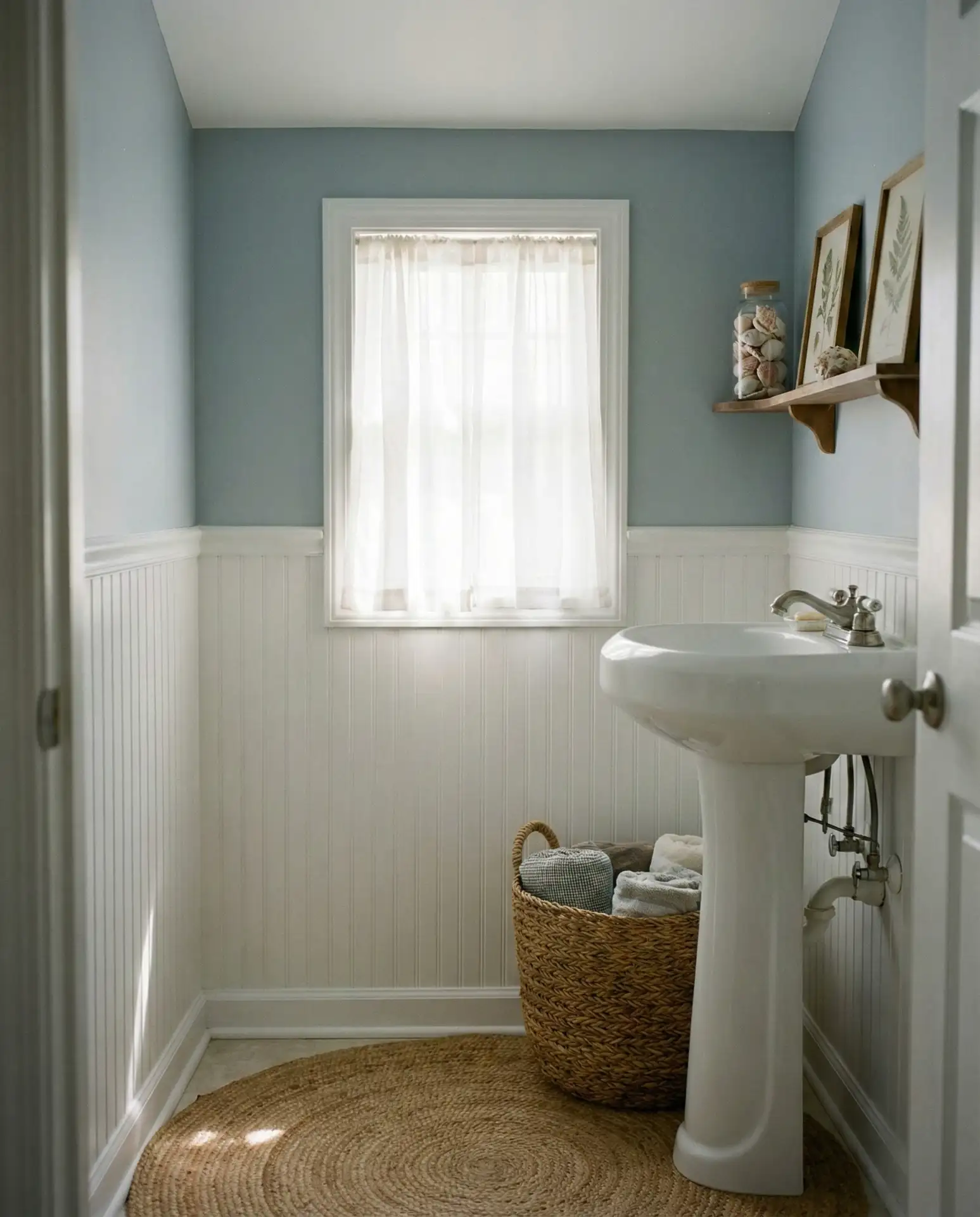
A calming blend of blue and gray evokes the misty freshness of coastal mornings and suits bathrooms seeking tranquility without trendiness. This color enhances smaller rooms with a sense of spaciousness and pairs effortlessly with white fixtures and natural textiles like jute or linen, fostering a carefree, peaceful ambiance. 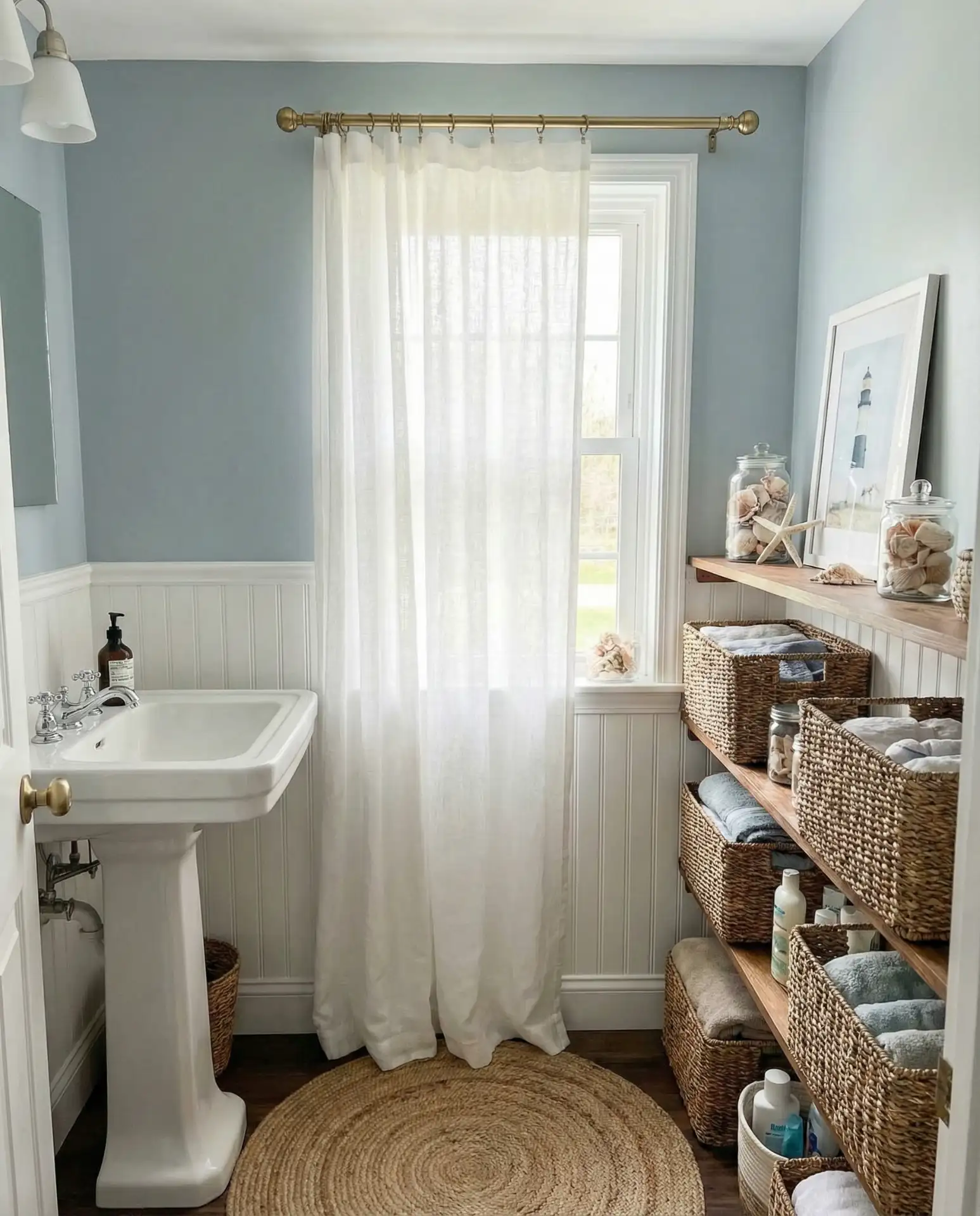
While a favorite in coastal states stretching from Maine to Southern California, this tone also finds fans inland who crave an all-year-round retreat vibe. Its chameleon nature adapts to lighting direction and intensity, displaying subtle temperature shifts that require testing prior to final selection.
Timeless Warm Taupe Complements Bold Black Fixtures
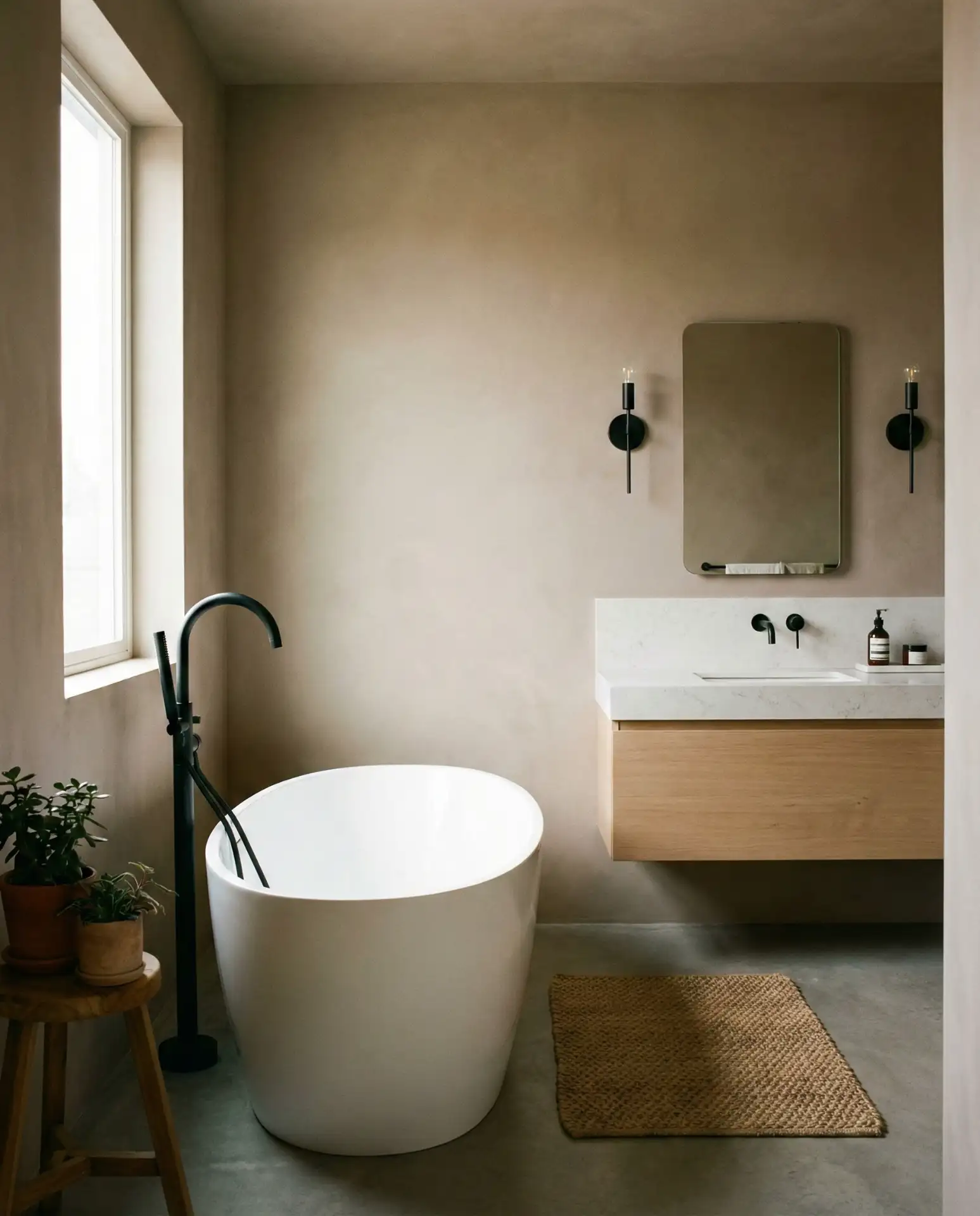
Warm taupe, richer than classic beige, offers a stylish neutral foundation highlighted beautifully by matte black hardware. This sophisticated hue fits effortlessly within both contemporary and farmhouse aesthetics, quietly showcasing architectural detail and allowing accessories to stand out. 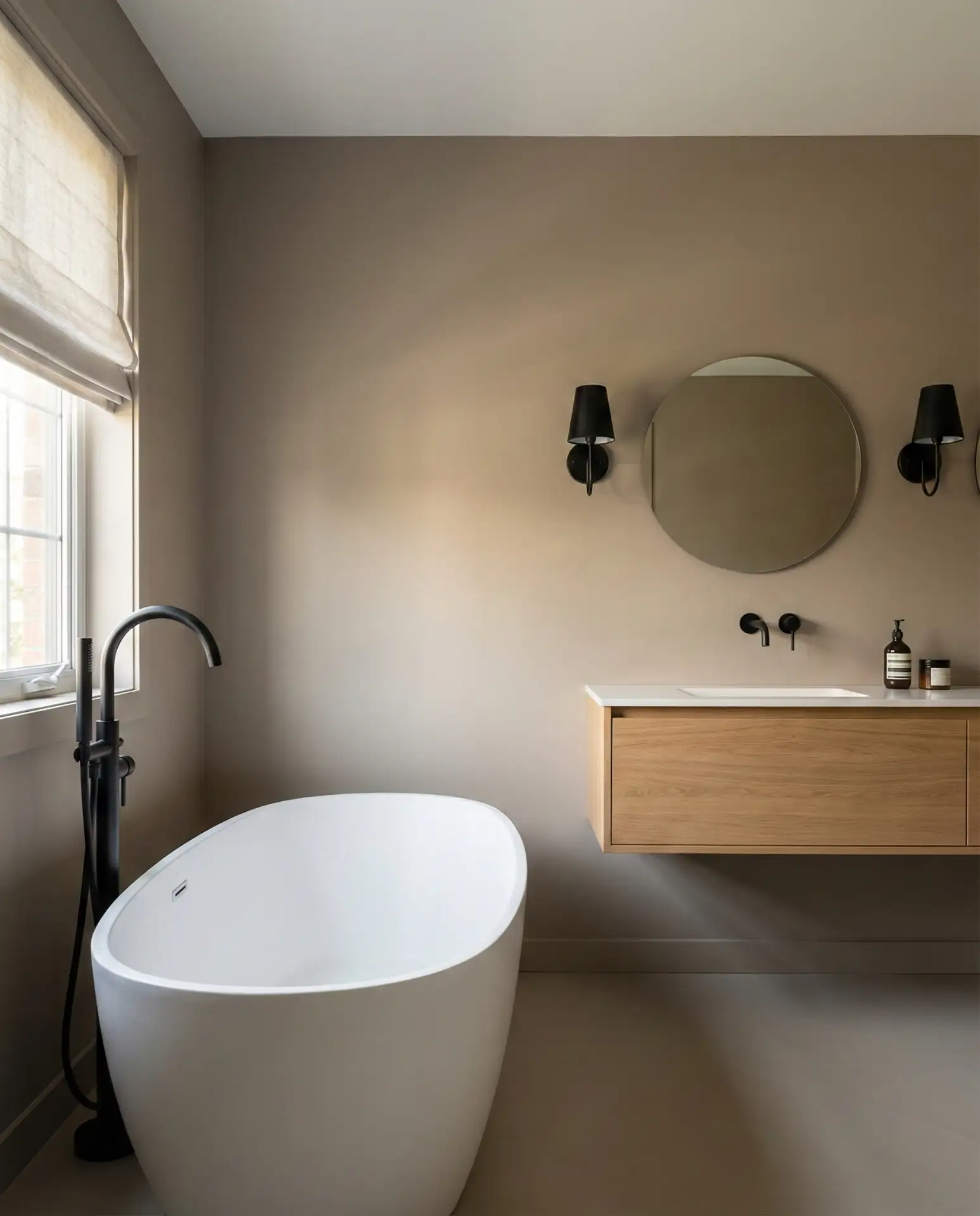
Interior stylists note that taupe’s versatility satisfies clients who initially choose it cautiously but grow to appreciate its low-maintenance charm and compatibility with finishes ranging from brass to chrome. It also discreetly camouflages everyday smudges, making it practical for bustling households.
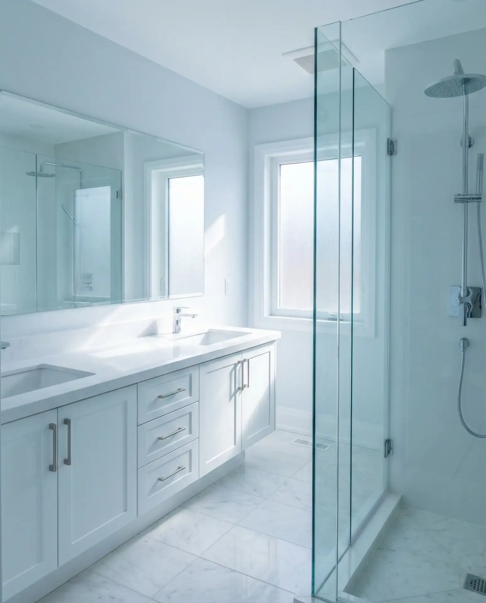
Sherwin Williams Alabaster: The Warm White Workhorse
Sherwin Williams’ Alabaster is the preferred warm white vehicle for comprehensive bathroom transformations, offering softness that sidesteps the sterility of bright whites. It suits tiny powder rooms as well as expansive master baths seamlessly, unifying walls, trim, and ceilings for an airy and harmonious atmosphere. 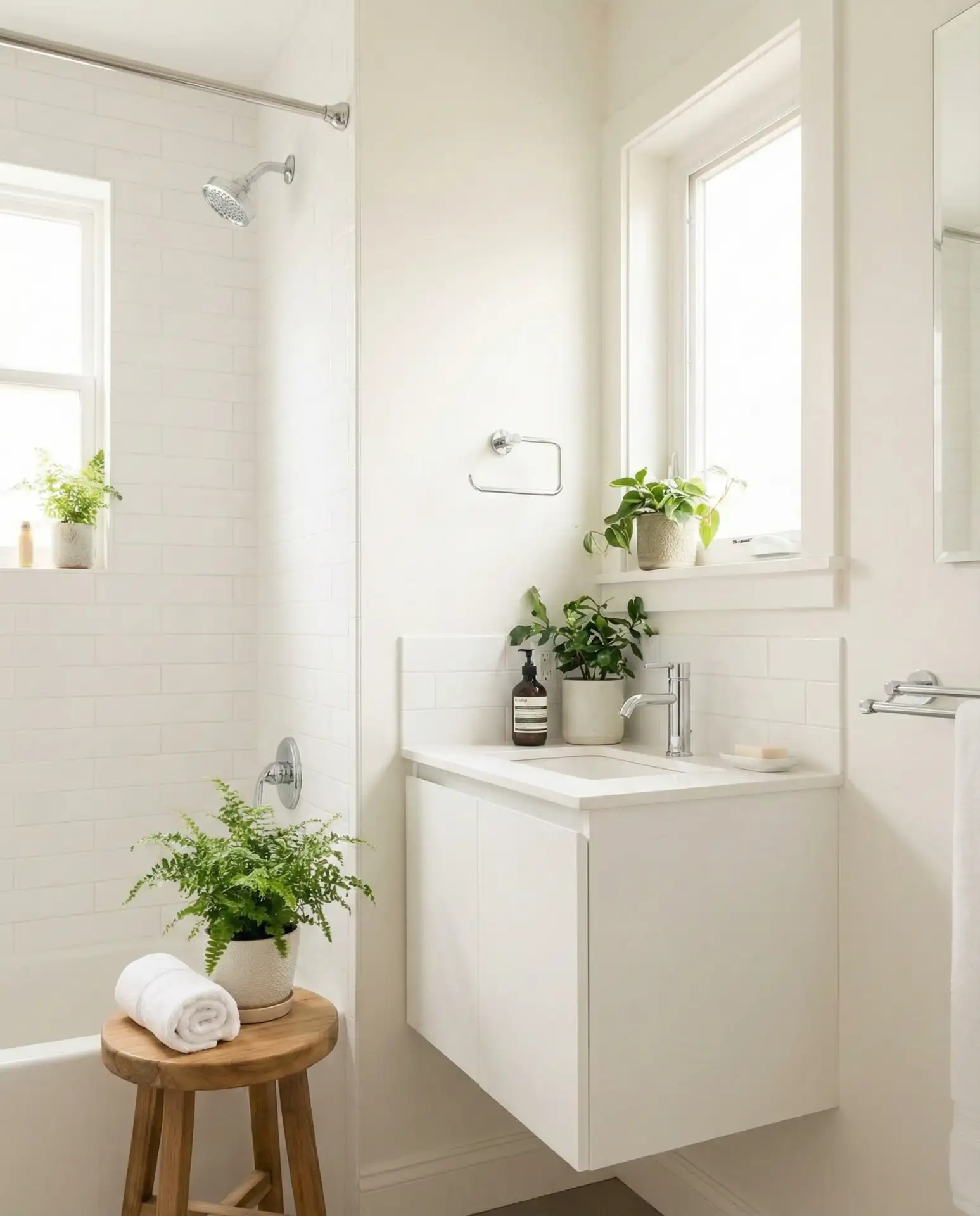
Praised for its consistency across finishes, Alabaster ensures that flat walls coordinate effortlessly with semi-gloss trims, creating a professionally finished look accessible to DIY painters. Widely stocked at major outlets, it makes future touch-ups straightforward and stress-free.
Embrace Vintage Flair with Dusty Lavender
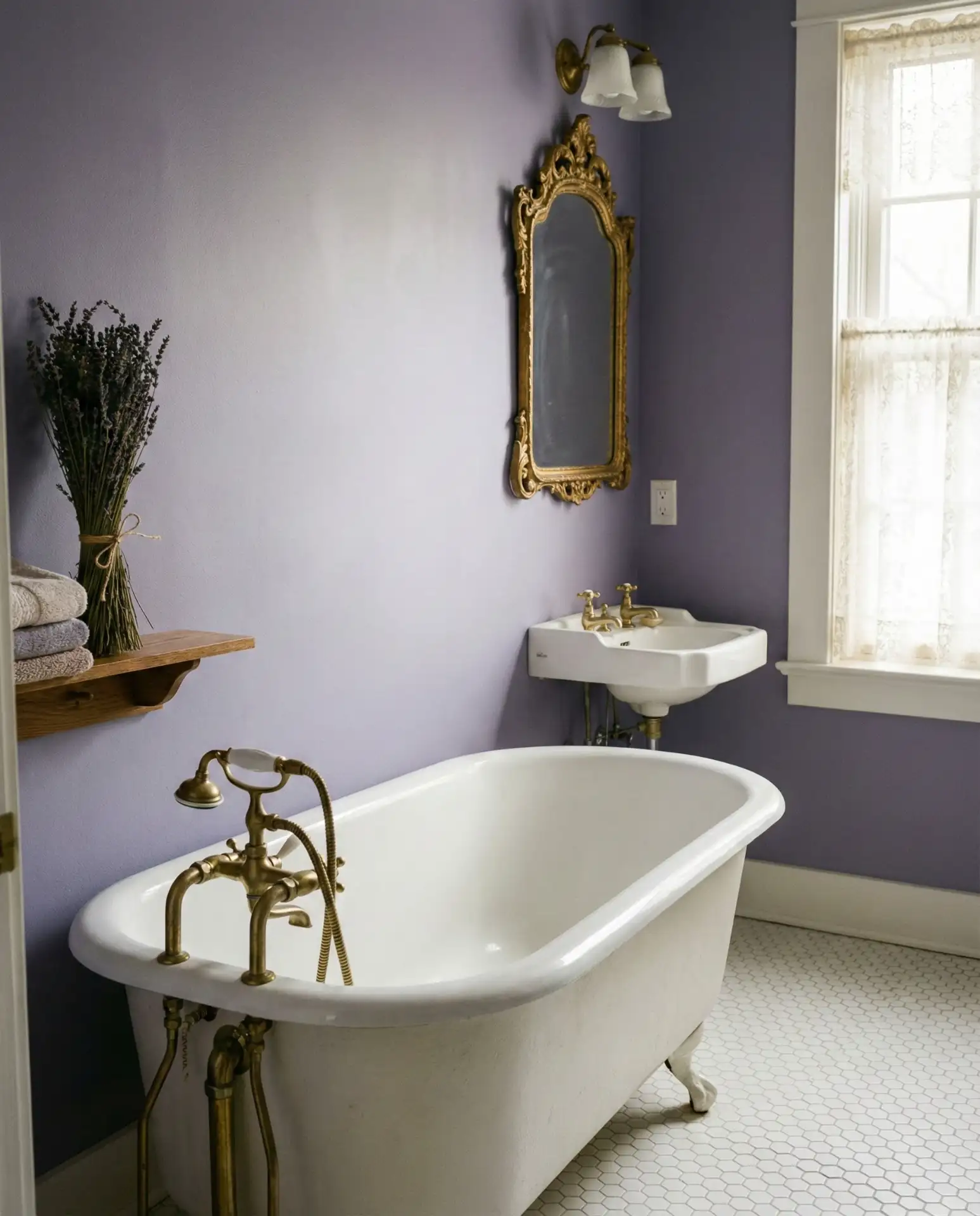
Dusty lavender infuses bathrooms with classic romanticism without appearing cloying or outmoded. This purple-gray hue serves as a compelling alternative to pink, ideal for guest baths aiming for a unique, inviting vibe. It pairs effortlessly with aged brass, elegant porcelain, and historic tile patterns, creating spaces that seem thoughtfully accrued over time rather than recently renovated. 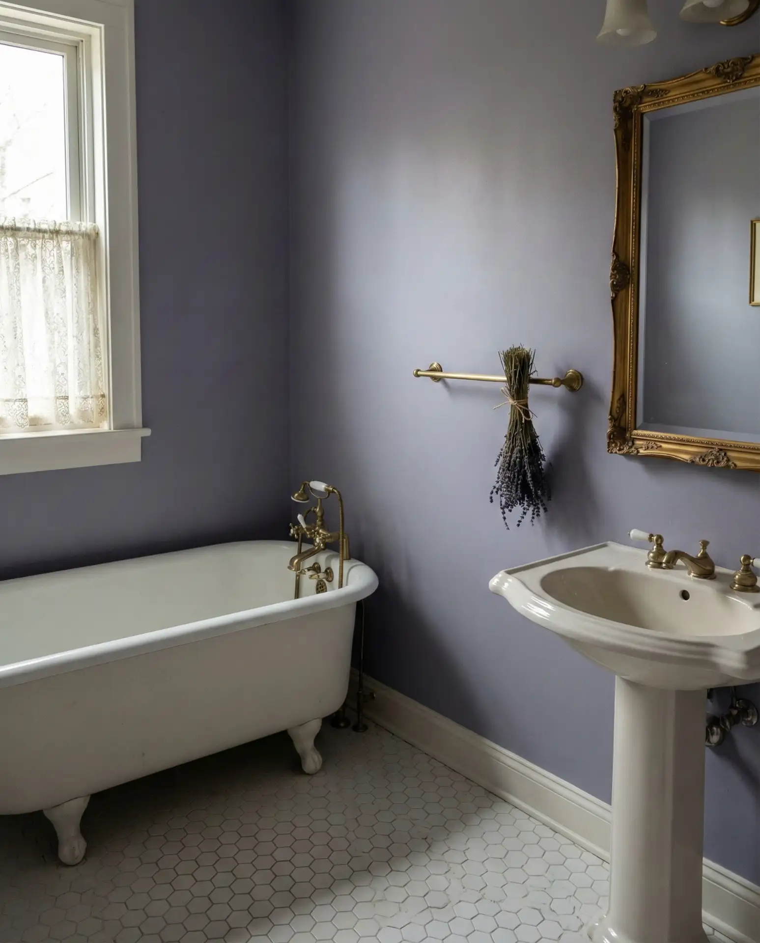
Especially fitting in homes with period architecture—such as early 20th-century bungalows or Victorian townhouses—lavender acts as a respectful pause in restoration, transforming even relic spaces with simple wall paint and original fixtures.
Bright White Foundations with Vibrant Tile Features
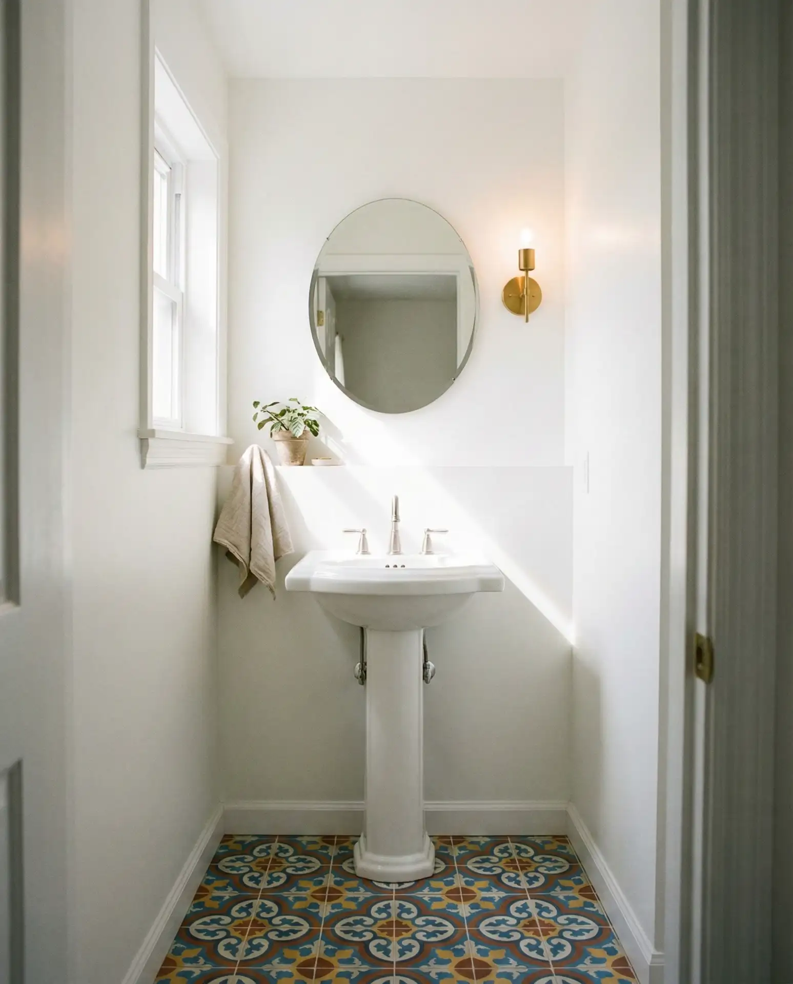
Spotless white walls act as a perfect backdrop for integrating lively, colorful tile accents that inject personality and artistic flair. This design tactic shines in petite bathrooms where maintaining lightness is vital. Consider Moroccan-inspired zellige tile in rich jewel tones or artisan hand-painted ceramics to create a gallery-worthy shower niche or floor detail. 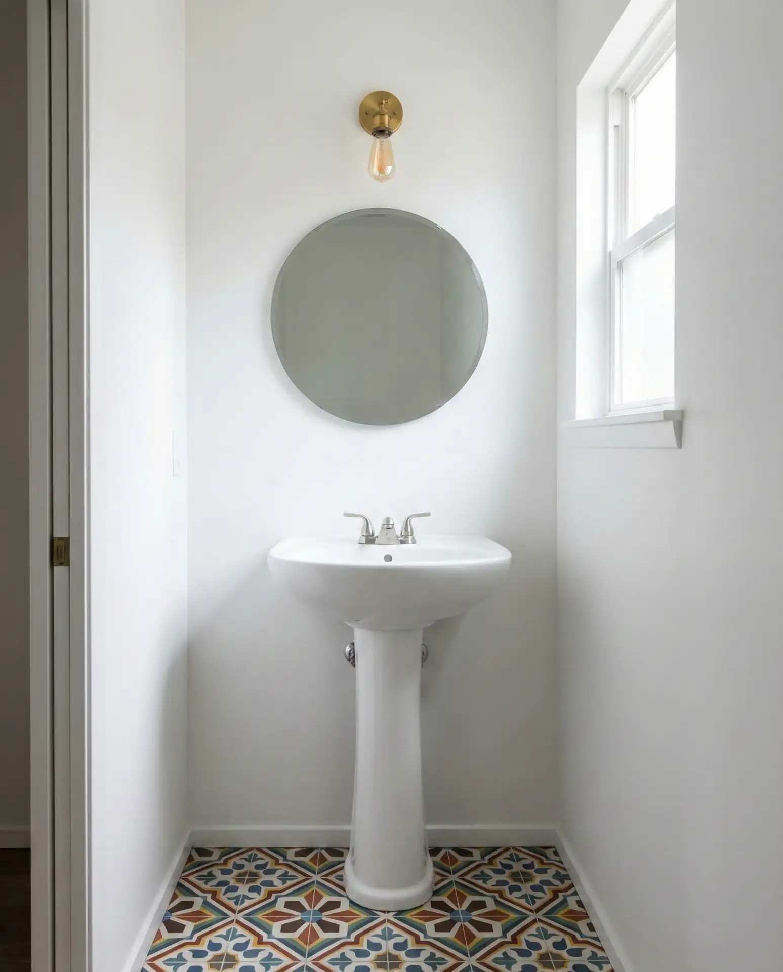
Avoid the pitfall of mixing multiple busy tile patterns simultaneously, which can overwhelm visually. Instead, focus on one vibrant area surrounded by calm simplicity to maximize impact while preserving harmony.
Grounding with Rich Olive Green
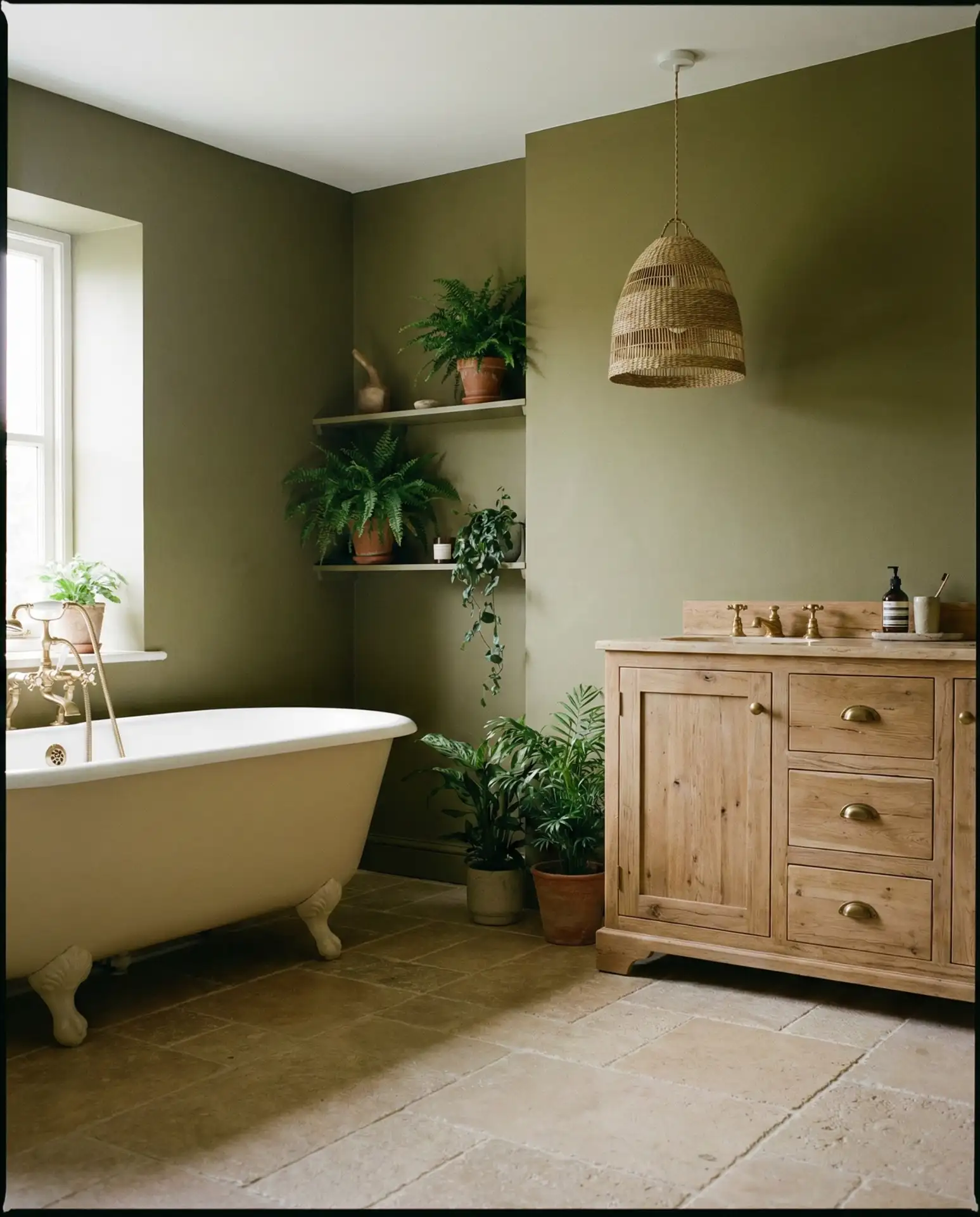
Olive green delivers a deep, natural sophistication beyond lighter greens, bridging rustic and modern farmhouse themes with grounding earthiness. Paired with creamy fixtures and timber accents, this combination evokes balance and serenity, resonating with homeowners seeking an organic sanctuary. 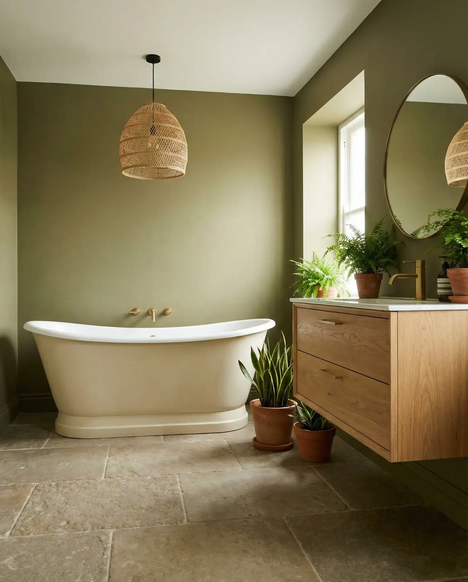
The shade is budget-friendly, concealing wear and tear far better than pale neutrals, extending the longevity of paint jobs. Peel-and-stick wallpaper options in olive green are also growing in market availability, perfect for renters or those wanting reversible style updates.
Enduring Impact of Black and White Contrast
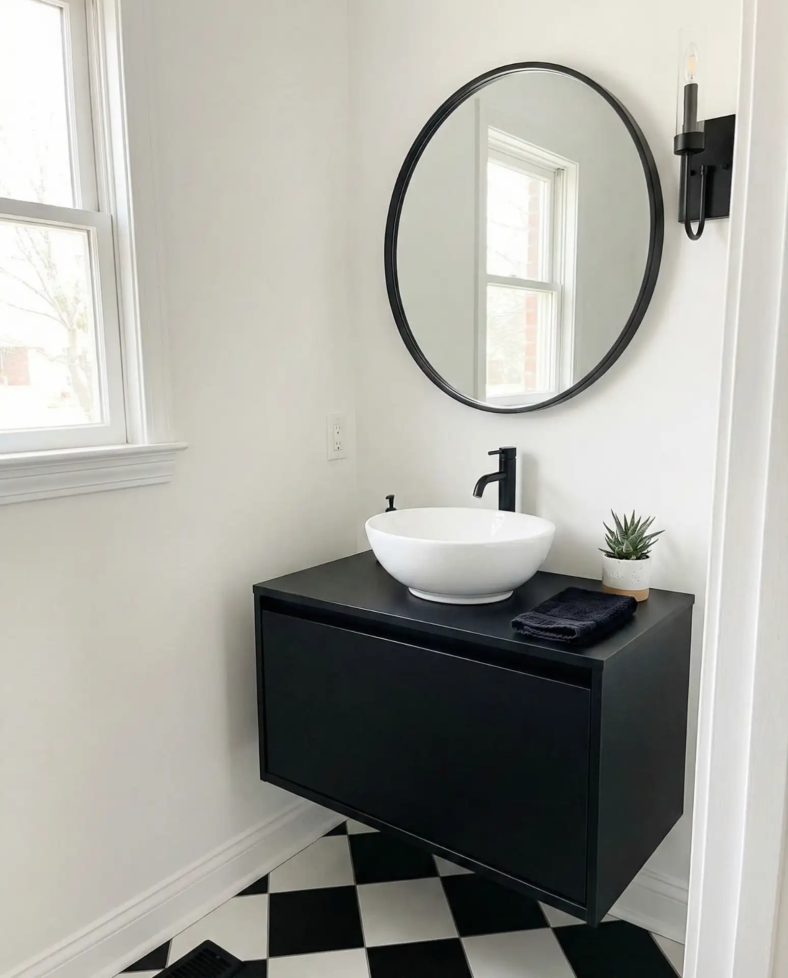
The stark contrast between black and white establishes a timeless graphic appeal, achieving bold drama particularly in small half baths. This classic duo pairs beautifully with geometric tiles, subway brick walls, and flexible fixture colors, offering broad appeal while embodying modern elegance. 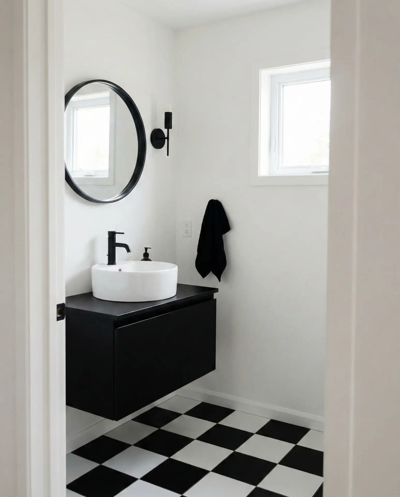
Best suited for powder rooms near entryways, this palette lends architectural weight and commands attention instantly. Incorporating a natural element, such as a leafy plant or rustic wooden stool, softens the boldness and nurtures warmth alongside clean lines.
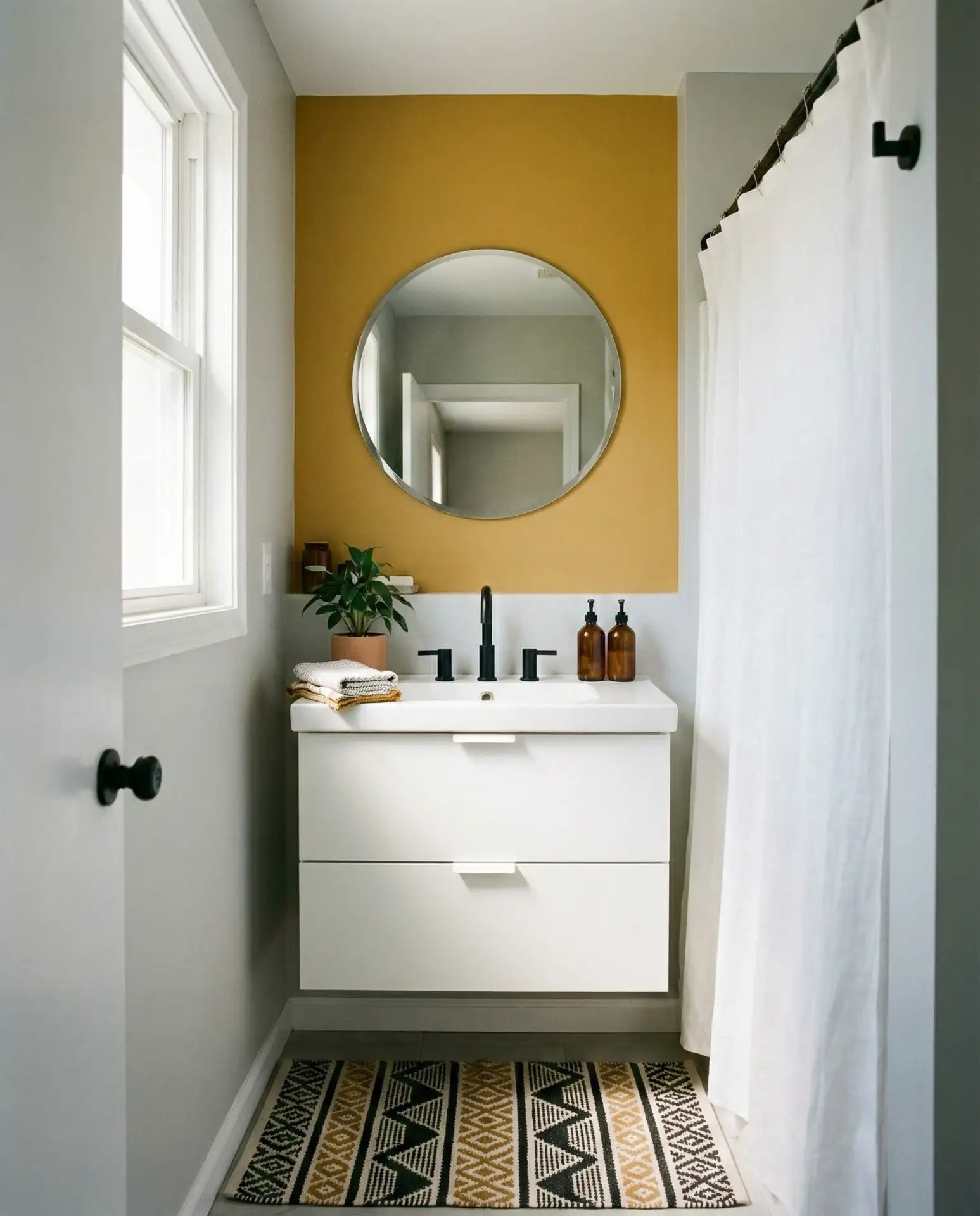
Cheerful Mustard Yellow Details
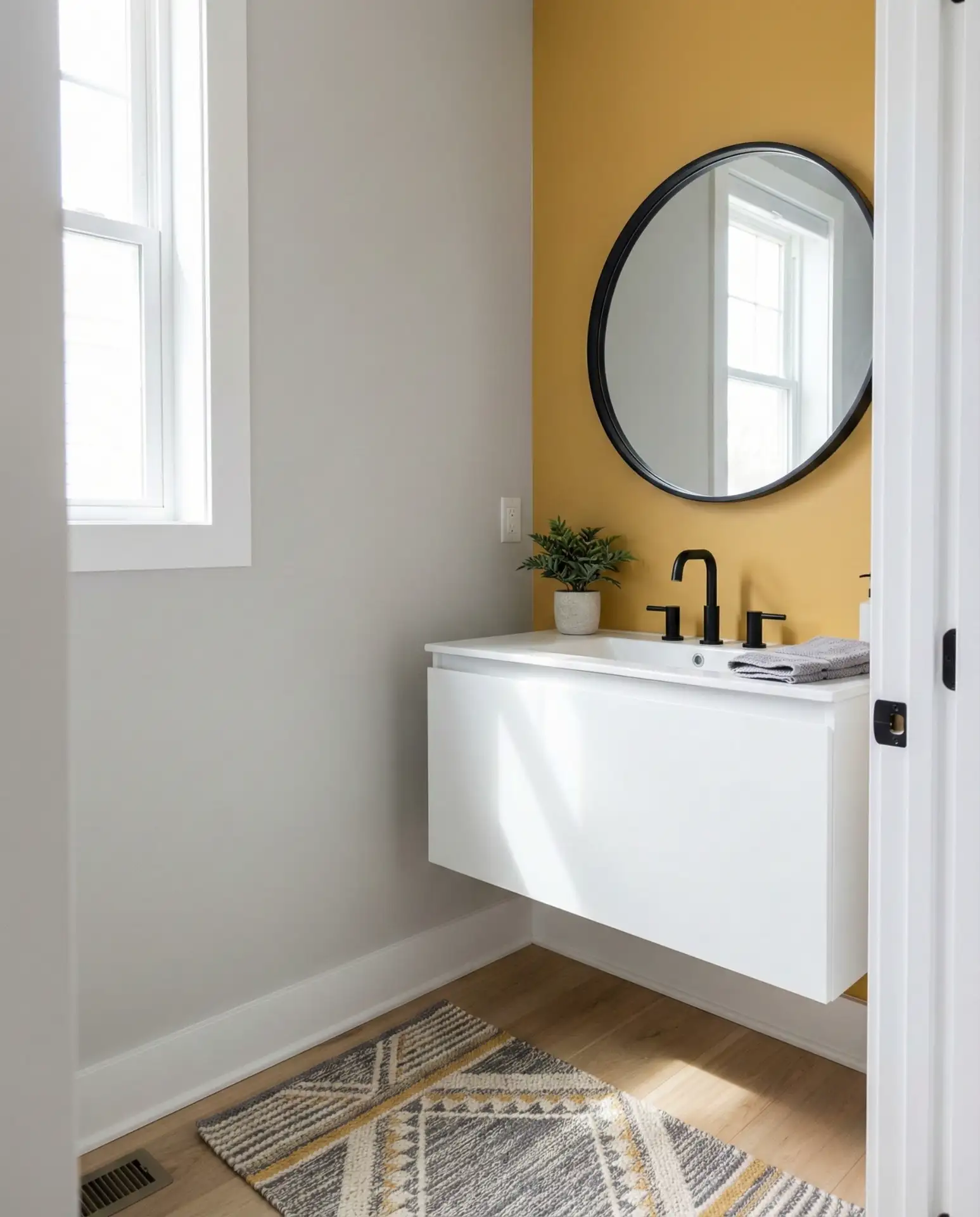
Mustard yellow punctuates neutral spaces with a lively pop of color that doesn’t overpower. Ideal for feature walls, cabinetry interiors, or shelving nooks, warm yellow complements shades like gray, navy, and crisp white, brightening rooms even with minimal natural light. 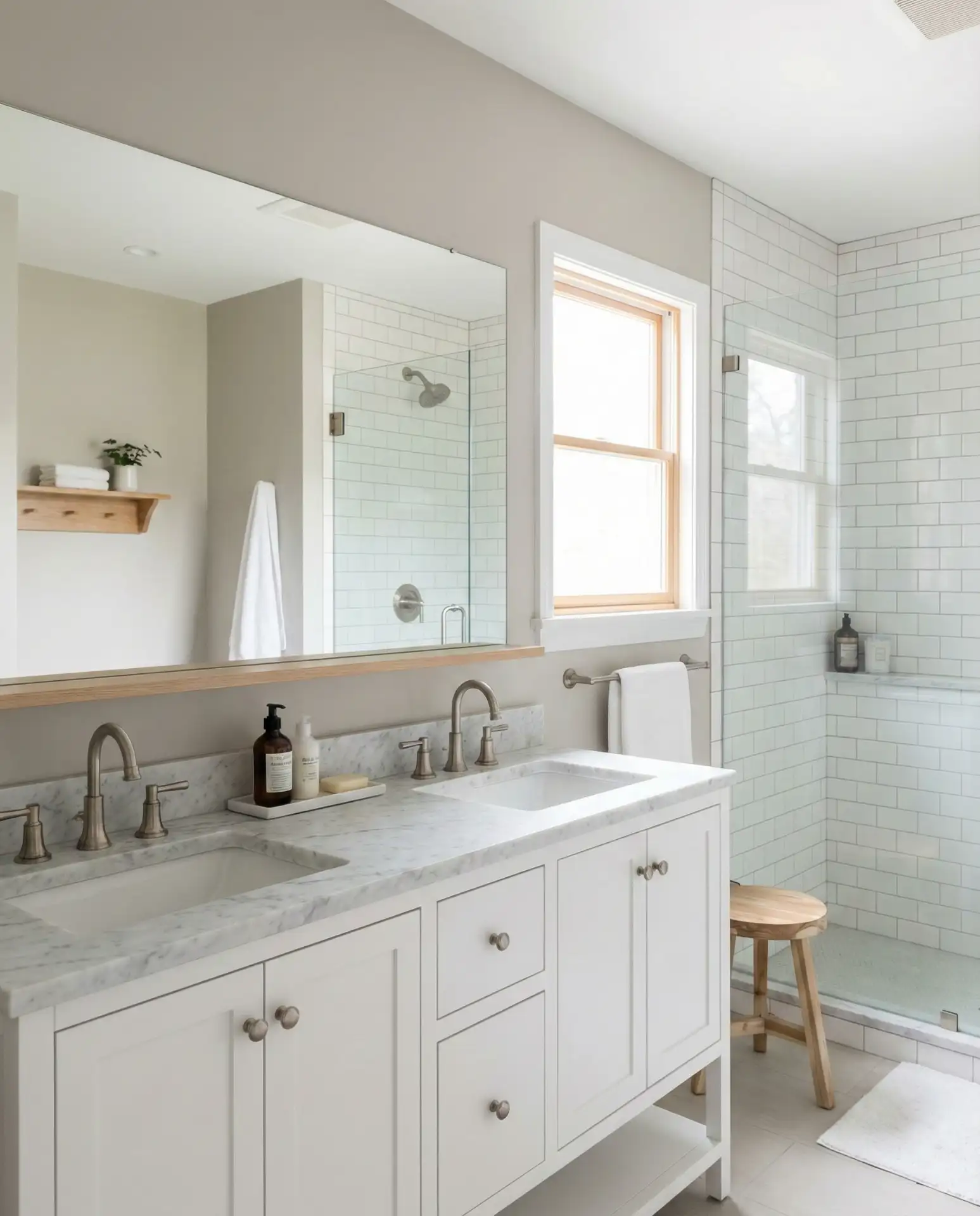
Homeowners often introduce mustard in subtle doses initially—perhaps inside a medicine cabinet or as a thin painted stripe—gauging comfort before larger applications. This incremental strategy supports confident color commitment and allows for easy accessory swaps if desired.
Soft Greige: The Perfect Balanced Neutral
Greige — the ideal blend of gray and beige — has earned its place as the ultimate neutral palette for bathrooms, appealing broadly regardless of style or space. This warm, understated shade provides a sophisticated alternative to standard beiges, frequently suggested by realtors to maximize buyer appeal in staging. 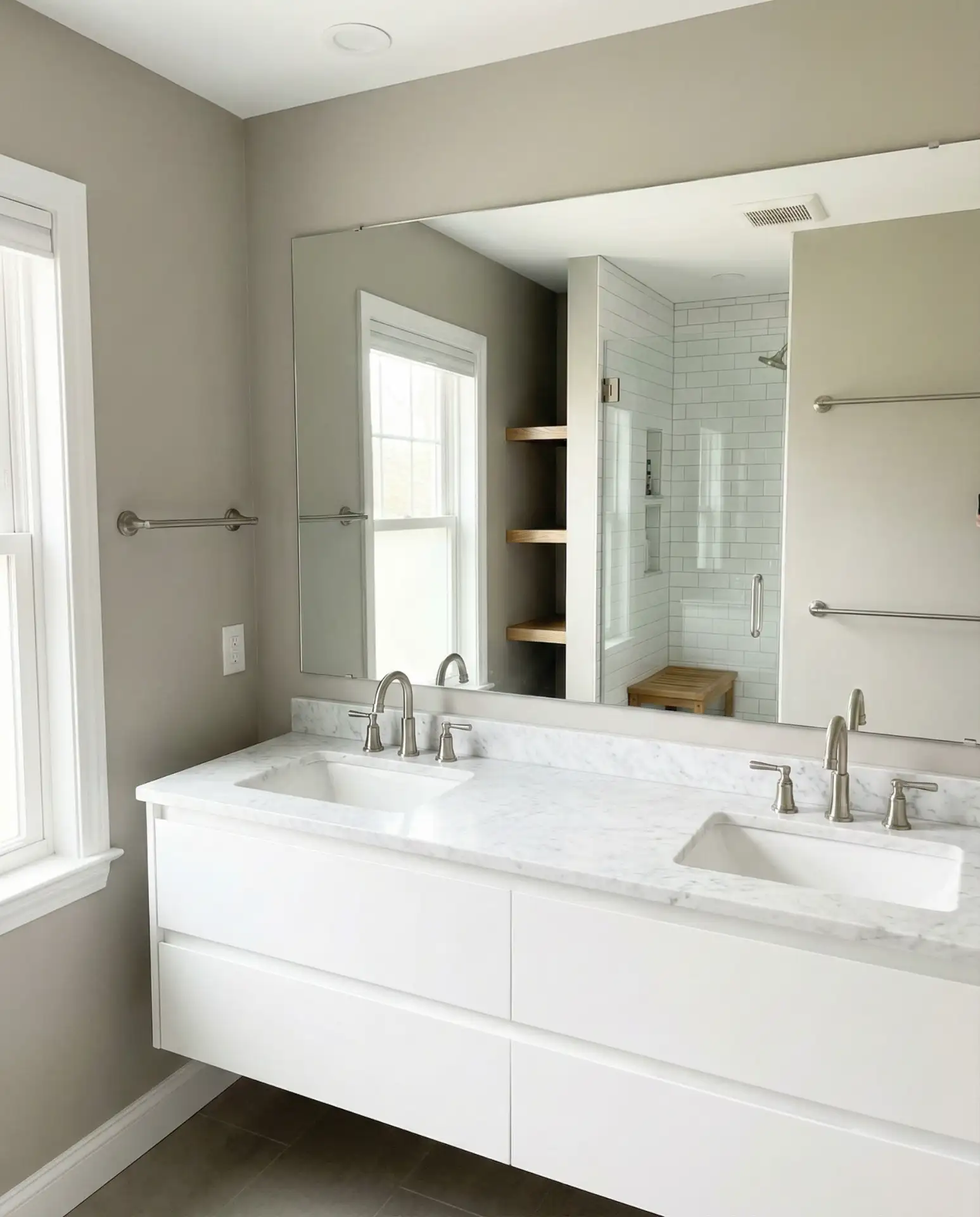
Professional painters stress the importance of testing greige samples under the bathroom’s lighting setup—commonly 2700-3000 Kelvin bulbs—to account for color shifts caused by artificial illumination at different times of day.
Bold and Classic: Deep Teal with White Trim
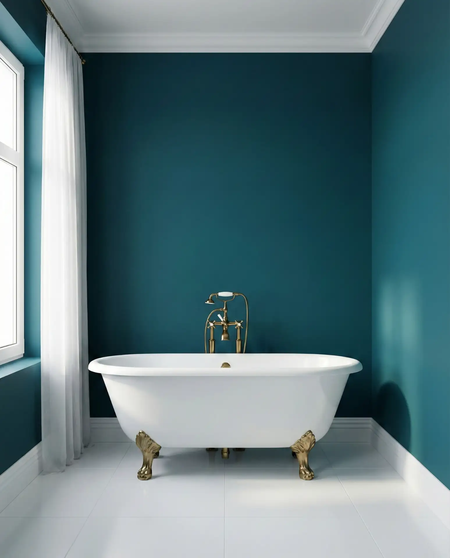
Combining deep teal walls with crisp white trim merges vintage richness and contemporary refinement. This blue-green shade delivers impactful drama while remaining lighter and less overpowering than navy blues. Enhanced by warm metallic fixtures, particularly brass or gold, this palette elevates main bathrooms with luxurious balance. 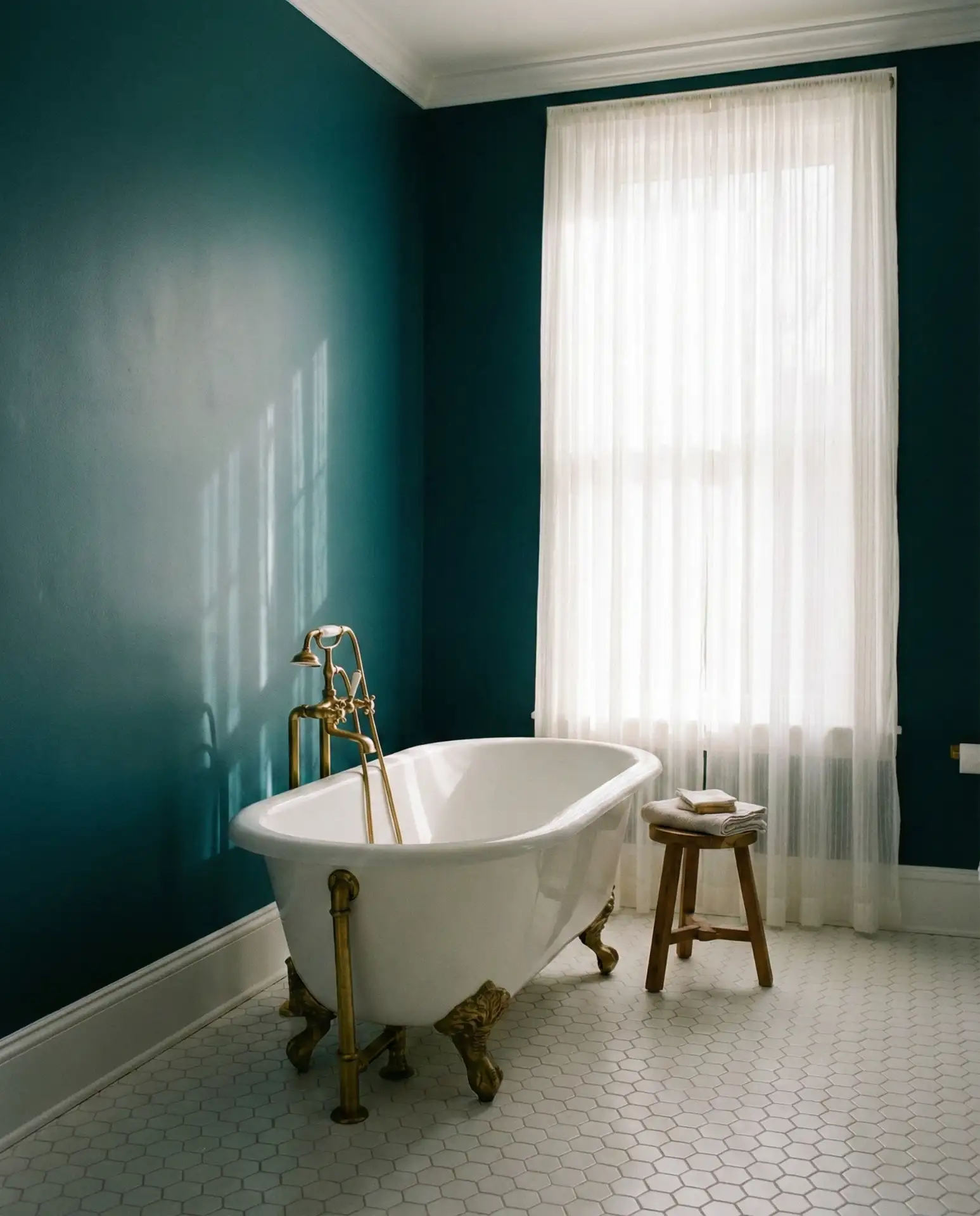
Sunny Ambiance from Soft Butter Yellow
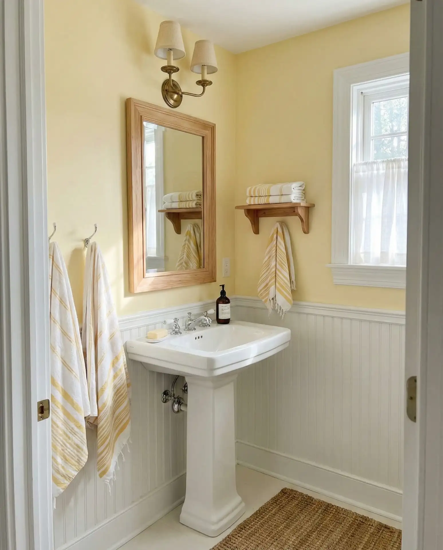
Soft butter yellow offers a cheerful yet gentle glow, perfect for smaller bathrooms or vintage-inspired schemes. It conjures nostalgic daylight warmth, especially suited for cooler regions where natural light is treasured. Couple it with white plumbing fixtures and natural wood touches for a well-rounded, inviting space. 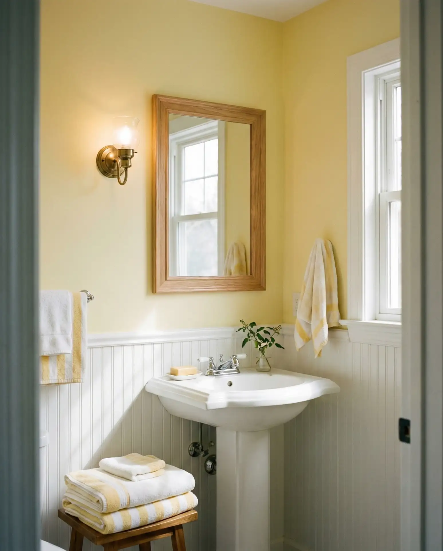
This nuanced yellow is regaining favor for its sophisticated take on brightness, skilfully avoiding the juvenile impression of brighter primary yellows from decades past. The secret lies in choosing a hue with gray undertones for an updated, timeless effect.
Industrial Warmth: Charcoal Walls with Copper Fixtures
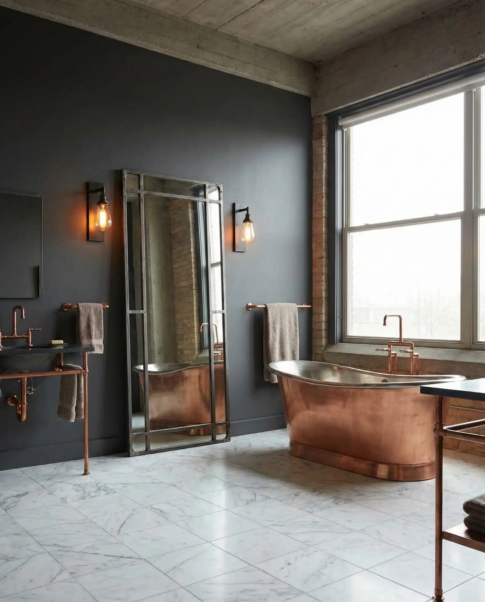
Combining charcoal gray walls with glowing copper hardware delivers a trendy industrial-chic feel that balances urban ruggedness with inviting warmth. This blend suits spacious baths where proper lighting offsets the darker palette. 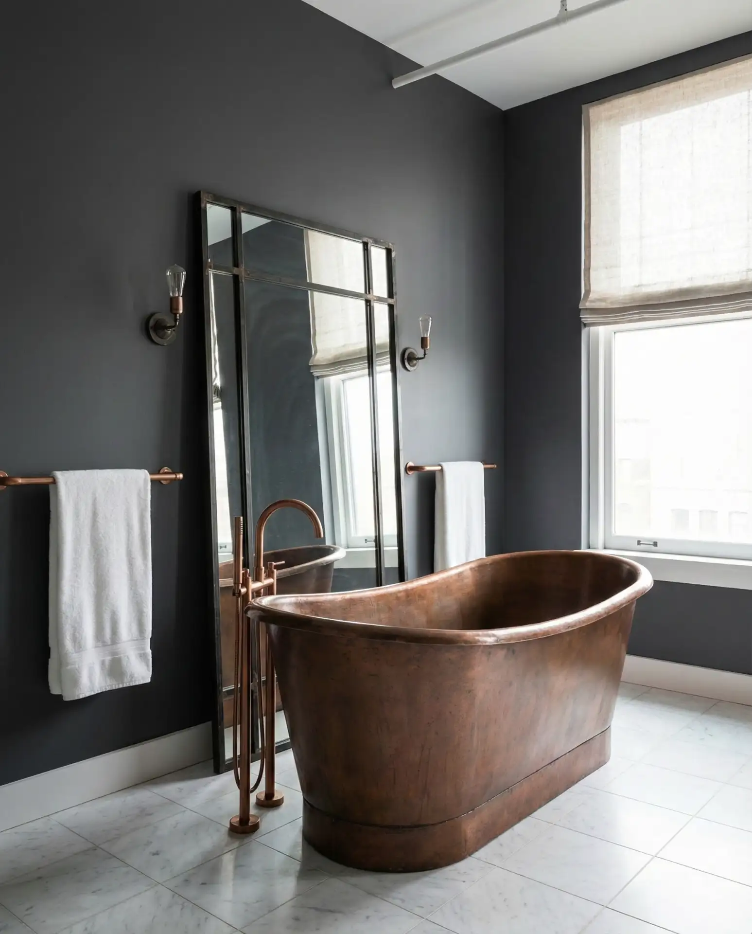
To avoid a gloomy atmosphere, layer lighting sources strategically, including overhead fixtures, vanities, and subtle accent lamps near key areas, ensuring copper finishes radiate luminously against the muted charcoal backdrop.
Refreshing Spa Sensation with Pale Aqua
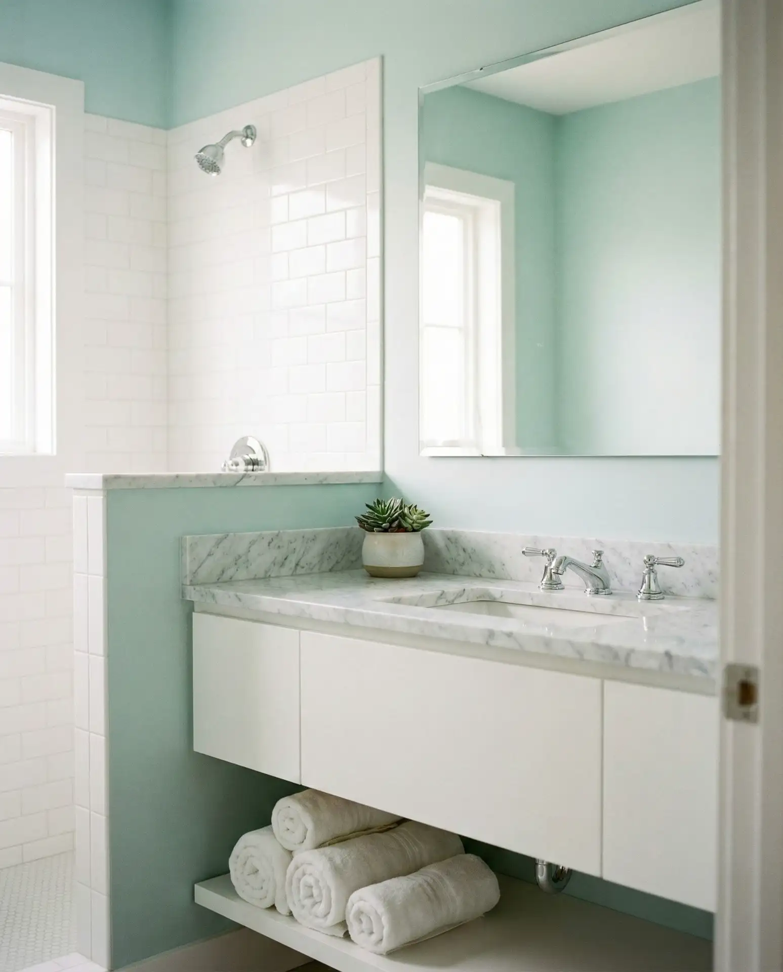
Pale aqua embodies the tranquility of spa retreats, balancing hues of soft blue and green to create refreshing, calm bathroom retreats. Ideal for compact or guest bathrooms, this shade uplifts spaces without veering into childishness. It pairs perfectly with white marble, pale wood, and chrome or brushed nickel fixtures for a modern, hygienic appearance. 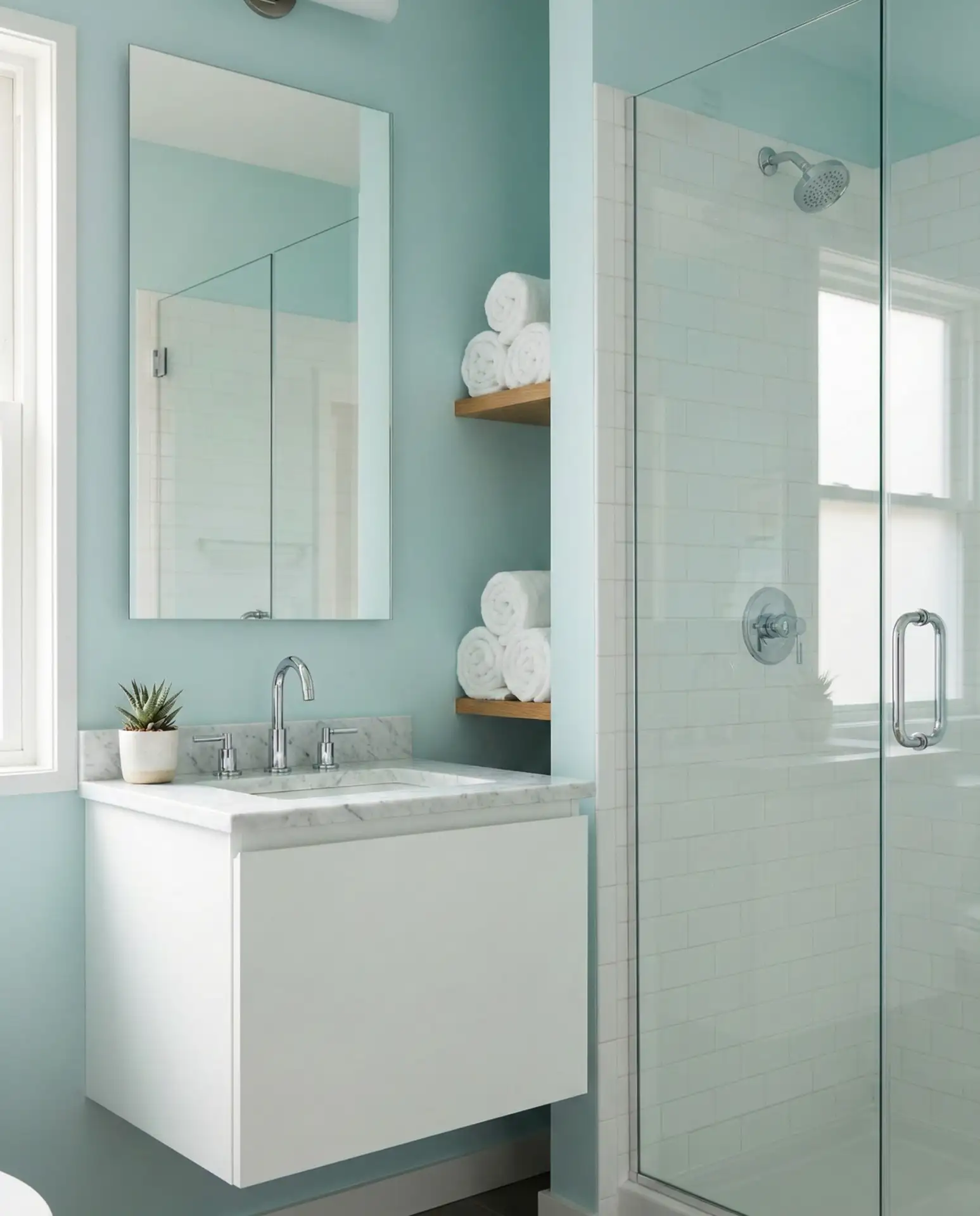
Popular in coastal locations from Florida’s shores to California beaches, it also appeals inland where homeowners seek a perpetual vacation feeling. Practitioners report that the color fosters relaxation during morning rituals, illustrating color’s psychological impact beyond aesthetics.
Inviting Warmth from Caramel Walls and Clean White Fixtures
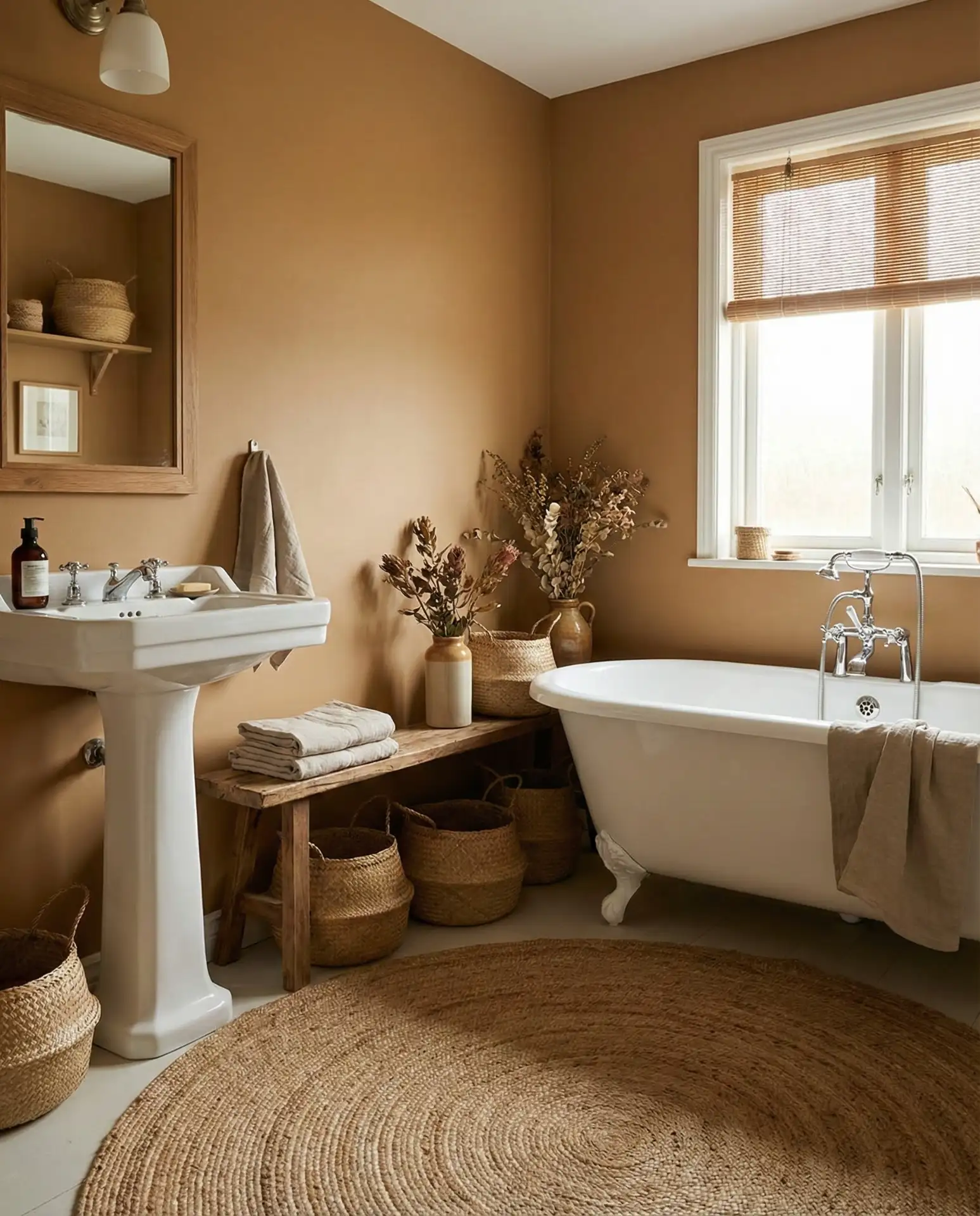
Rich caramel tones envelop bathrooms in a warm, comforting glow that’s deeper than typical beige but subtler than bold terracotta. This earthy shade complements rustic and natural aesthetics, creating a welcoming and timeless atmosphere when paired with crisp white fixtures and natural elements. 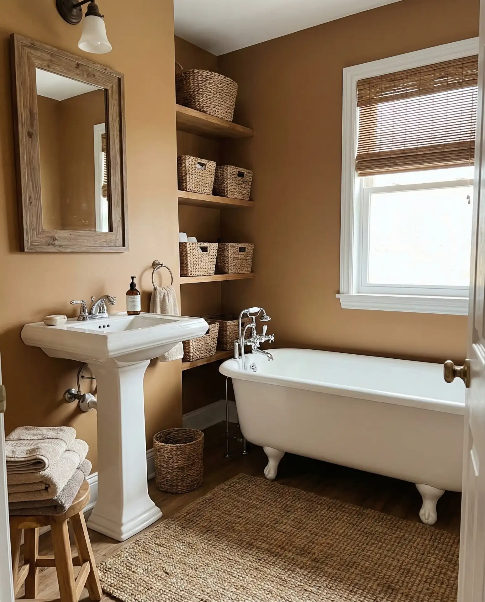
Cost-effective and forgiving, caramel paint typically offers strong coverage with fewer coats, making it ideal for budget-conscious remodelers aiming for a polished finish free from common application frustrations associated with whites or vibrant colors.
Icy Blue-White with Sleek Silver Details
An icy blue-white tone creates a crisp and refreshing ambiance reminiscent of a winter landscape, ideal for bathrooms that desire a neutral base with faint color hints. This delicate blue undertone enhances spaces when paired with silver or chrome hardware for a sleek, contemporary feel and is very effective in main baths aspiring to spa-like calm. 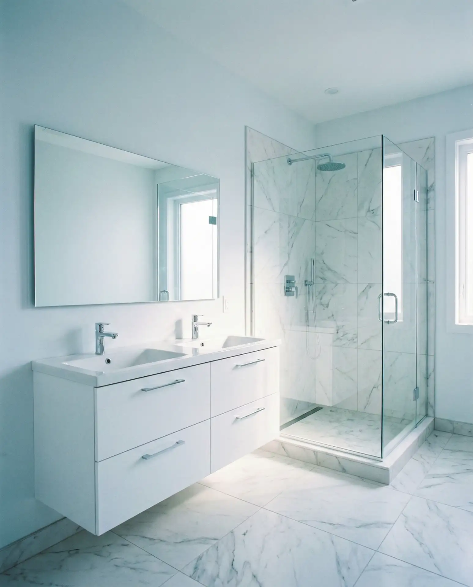
Optimal in well-lit rooms with southern exposure, this color can become too cool or stark in shadowed interiors. Homeowners in warmer climates often choose this palette to impart a psychologically cooling effect, enhancing comfort during hot weather.
Final Thoughts: The Spectrum of Bathroom Color Trends
The color trends outlined here reveal the rich tapestry of inspiration motivating homeowners—from grounding hues rooted in nature to lively jewel tones, from understated neutrals to impactful dark shades. What unites them is purposeful selection: colors chosen to fulfill both functional needs and emotional resonance, crafting bathrooms that enhance daily routines while reflecting individual spirit. Which palette resonates with your vision? Engage with us below and share your bathroom color stories or upcoming projects; we eagerly await your creative journeys.